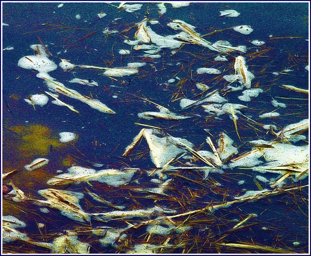
I gave it an 8. Looking at the original now, I would still give you an 8 for the image, but a 12 for how you got there! I'm pretty green at PhotoShop, and often amazed at what can be done. Learning a lot here from seeing what others have been able to do. Keep up the excellent work!
fyi seven....... underated on my scale.
Excellent colour work, even though obvious ps and edit, fantastic blue and foam...
funky green and brown/red gunk is digital pasty, but alive and contributes wierdly.
+++ presentation
+++ composition
I like your idea a lot, but it went somewhat flat. Needs better lighting. Like how you cropped it... no unwanted and distracting stuff. The focus is fully on your topic. Interesting.
looks yucky! Lots of noise in your image - possibly due to over processing in PS. Not sure that I "like" the image very much, or that it is instantly "primordial soup".
Seems a little too grainy and un sharp IMO. Great thought for the challenge. Border is nice but try it with a white external border added to what is there.







 Add photograph to your favorites
 Add photographer to your favorites

 Photographer found comment helpful.


