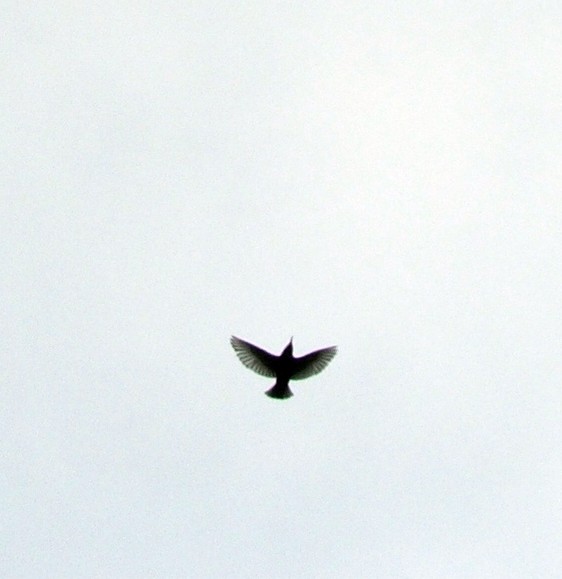
I like the overall concept but the title fails to convey the theme. "First Flight" or "Flying School" or something to that effect might have worked better. I also find the focus is too soft.
Negative space. It's the rage. But I'm an Apple fan. Apple ad agencies almost singlehandedly created negative space in the late 1980's. And as with any 20 year old fad, I look forward to the time its overuse is over. If I were going to do this photo, rotate and crop so that the bird was near a corner and facing (just about) the opposite corner. But then I'm not a graphic artist by training.






 Add photograph to your favorites
 Add photographer to your favorites


