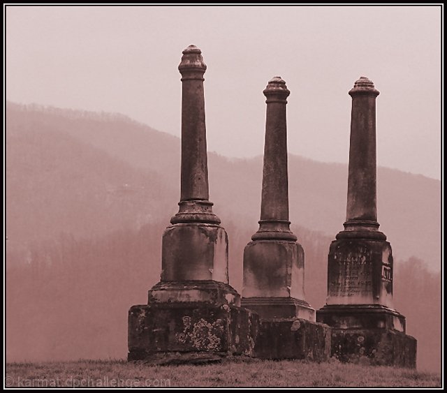
Greenhill Cemetery in Waynesville, NC> It is one of the oldest in the area (besides teh small family ones). I have no idea who or what is buried under these three, but i liked the mountains in the background. Would have like to do something a bit more "interesting," but just didn't have the time/models/ideas. :(
Post processing --
cropped,
cloned out teh corner of another stone in the lower right corner
played with teh curves
played iwth color
mirrored it
did't like, unmirrored it
noise reduciton
unsharp mask
resized
bordered.
THEN realized I had saved over the original
I had been bracketing the shots, so I took on the "under" side, adn tried again. Same steps, different shot.
Statistics
Place: 76 out of 281 Avg (all users): 5.5578 Avg (commenters): 6.8667 Avg (participants): 5.5547 Avg (non-participants): 5.5634 Views since voting: 963 Views during voting: 310 Votes: 199 Comments: 17 Favorites: 0
Kind of ugly noise (not the good 'grain effect'), and rather bad colours (I'm assuming that you aimed for a sepia effect here). More could probably been made of the 3 subjects
(diffrent angles etc)?
I find this curiously appealing. I think I'd find it even more so if the toning were other than this weak burgundy. My first reaction tot he overall tonal range was that it was too flat, needed some more contrast, but now I'm wavering on that.
I am making two passes on this Challenge. I will vote on your photo then return later(before voting is over) to comment on what I like and dislike about your shot. You can take the comments however you wish and I will try not to be mean. Just don't take it the wrong way.
--------------------------------------------------------------------------------------------------------------
I like it. The only thing that bothers me is the border. I don't like the two different colors. Maybe white would be fine.
this is good..the tones and positioning of stones is good; I even like the pink tint to this shot, it adds a softness and feeling of time's passage...8
Lovely shot. I particularly like the way they each lean in slightly different directions. Good composition. Personally I find the toning too pink/ red.








 Add photograph to your favorites
 Add photographer to your favorites

 Photographer found comment helpful.


