This is where Michael, the KING OF POP's final resting place... It fits and it has serenity. Michael, may you rest in peace and we all be missing you forever... We love you more! Farewell..
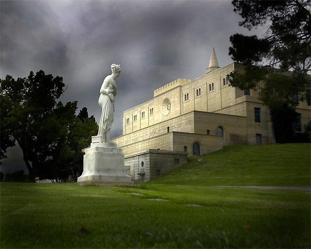
Very nice shot. It has a very brooding dramatic 'feel' that is quite fitting for the image. I like the subtle framing by the trees, and your comp has a nice vertical splitting the image. The statue adds a strong element of interest also. Very nice.
Beautiful shot! Great tones and feeling in your photograph. I might have cropped a little more off the left side. I think small patch of sky under the lefts side of the tree takes away from the statue. Congratulations on a top 5.
I liked the statue and mausoleum composition idea. This shot was taken on the second day, the earlier image was shot higher. This was shot about a foot off the ground and made a stronger image.
Spent more time editing this challenge image than any other I can remember. I really wanted to edit towards a very dramatic lighting scene.
There was no sun breaking through the clouds. The lighting effect was created by dodging and burning with the idea of creating an uneven look as it would if the clouds were really thick and thin.
The background sky was more difficult than the rest, nature did not give me exactly what I wanted that day. I re-did the sky editing 2 or 3 times to get it to this look.
Nicely done. It looks a little overprocessed for my taste, but I do like the way the building and sky turned out. It gives the composition a very dramatic look.
In many ways this is just totally outstanding. The juxtaposition of the main elements, however, is not as good as it might be. The aggresive occlusion of the mausoleum by the tree on the right is particularly clumsy-feeling to me, and the statue seems too close to the mausoleum as well, not by a lot, but it's sort of uncomfortable. I think also a little too much foreground... nevertheless, a strong entry and should do well.
I am making two passes on this Challenge. I will vote on your photo then return later(before voting is over) to comment on what I like and dislike about your shot. You can take the comments however you wish and I will try not to be mean. Just don't take it the wrong way.
--------------------------------------------------------------------------------------------------------------
I like it. The low pov works here.
it appears you have a strong base image, but the burning is a bit uneven. this might be a good image to revisit and practice on until you are producing the image that you are after. let me know if you want some tips.
First impression: the lighing here is exquisite. Second impression; burning and dodging seems a bit too obvious for my taste I'm sitting here thinking about it rather than the photo.





 Add photograph to your favorites
 Add photographer to your favorites


 Photographer found comment helpful.


