yikes, what happened here? should have done better. i think images where the subject and the background blend beautifully together but are still visibly distinct don't do as well as images where the subject pops out obviously on DPC because a lot of people need glasses. :)
I'm just a bit (a lot actually) taken back by the low placement in the challenge.
:(
Guess no dramatic burned /dark skies = no high placement, forget that the composition is well-done and needs more that a 2 second glance to appreciate.
Do us and yourself a favor sher and DON'T change what and how you do it - it's a gift.
I am making two passes on this Challenge. I will vote on your photo then return later(before voting is over) to comment on what I like and dislike about your shot. You can take the comments however you wish and I will try not to be mean. Just don't take it the wrong way.
--------------------------------------------------------------------------------------------------------------
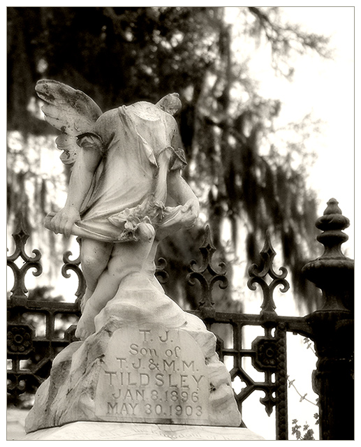
This is a shot were a closeup works. I like everything about it.
Nice choice of subject. I love the texture of the iron and the stonework. The composition is really good. And I like the overall effect of the lighting. I find the strongly mottled background makes it just a little too hard for me to focus on the subject. At one level it adds interest - it keeps me looking at the photo. But on another level, I ust want to give up because I find the task too difficult.





 Add photograph to your favorites
 Add photographer to your favorites

 Photographer found comment helpful.


