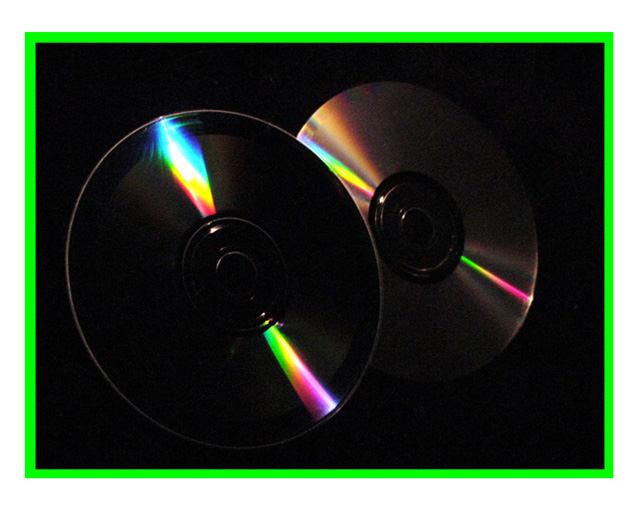
It's not the first time I've said it during this Symmetry challenge but this photo might just as well have been entered in the colour challenge! Ok, first impressions on this photo - there are two things that hit me right away. The first is that border - I find it very distracting. The green was a mistake in my opinion. The question of whether to use a border and how best to do it has been covered in length on the message boards but my own view is that it should improve the image without distracting from it. If it doesnt improve the image then it shouldn't be there. In this case I think you'd have been better served with something neutral in order to allow the eye to be drawn to the displays of colour in the main image.
That brings me to my second observation - the main image is very dark. Your comment on this photo says you used a single reading light in an otherwise pitch black room. That made it very difficult for you to bring out the full circle of the CDs. Using a single light source can be very effective but it's also tricky and doing it with very reflective subjects is that much harder. I think another light source would have made things easier. You could perhaps have had multiple reflected rainbows on each CD or a gentle light showing the whole scene as well as the strong rainbows.
Composition-wise your picture is just dandy. You've stuck to the tried and true rule of thirds and there's nothing at all bad about that. Your focus seems good but it's hard to tell because things are so dark. Exposure was always going to be difficult with such extremes of light and dark but you've captured the colours extremely well.
Overall it looks like you started with a very clear idea in your head about what you wanted to photograph. You've made significant progress in capturing that but the lighting and that border detract.
A bit too dark, but not sure if that would take away the prism light on the CD's. the back CD has noise on it, but that can happen from downsizing the photo to upload here. I hate the green border, but I do not take off for borders, even though I personally do not like them.
I like the abstract nature of this image... the part that bothers me is that the border is a stronger and more vibrant color than any part of the photo itself. In my opinion, the border here competes with the photo for attention... - setzler







 Add photograph to your favorites
 Add photographer to your favorites


