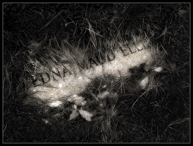
Okay, okay, yeah... it's a bit edited. I can't help it; cemetery shots just feel so right to me with a little blur and some crazy contrast going on. This is a grave that was almost entirely covered with grass, apparently the resting place of one Edna Maud. I took a LOT of cemetery shots, but this one is the only one that really jumped out at me, so I thought I'd go ahead and submit it. I expect people to think it doesn't meet the challenge... and I expect people to think it's too dark to see properly. I actually shot this on the verge of night, so the light level was quite bad, and flash just didn't work for this type of shot.
However badly it does, this is one that I REALLY like. It's moody and very "me" :) I'm hoping it'll be a bit different, but not so different that it's completely detested. :) And yes, I know it's grainy... again, I had to use ISO 100 because it was dark. I hope at least one or two people like it!
Editing: Converted to B&W with Channel Mixer and tweaked the curves a bit besides, used adjustment layers to get the contrast really deep and smooth like this and to give it a faded fuzziness that seems to fit... toned with hue/saturation, sharpened, resized, added a border. Some mild dodging and burning. Most of it is really the adjustment layers.
Statistics
Place: 29 out of 281 Avg (all users): 5.9495 Avg (commenters): 7.3333 Avg (participants): 5.7422 Avg (non-participants): 6.3286 Views since voting: 981 Views during voting: 326 Votes: 198 Comments: 13 Favorites: 0
I like this very much. I hope it does well. The tonalities are luscious, the understated nature of it is appealing. I wish the bright grass blades top center were burned way back though, I find them distracting.
I am making two passes on this Challenge. I will vote on your photo then return later(before voting is over) to comment on what I like and dislike about your shot. You can take the comments however you wish and I will try not to be mean. Just don't take it the wrong way.
--------------------------------------------------------------------------------------------------------------
Nice work. I like how it seems old(the photo). I even like the border. Everything works well here. Bumping up.
Very nice idea and composition! I only feel that you used the diffuse glow a little too much. It looks great on the stone, but a little too much on the leaves... however, that's only my opinion =)






 Add photograph to your favorites
 Add photographer to your favorites


 Photographer found comment helpful.


