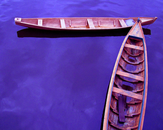
Adjust hue & saturation levels, auto contrast, auto levels, sharpened, cropped, cloned out some distracting spots on the water, color variations of more blue & less green (I think), & finally Neat Image
Statistics
Place: 63 out of 507 Avg (all users): 6.2470 Avg (commenters): 7.1923 Avg (participants): 6.1224 Avg (non-participants): 6.6909 Views since voting: 1992 Views during voting: 380 Votes: 251 Comments: 27 Favorites: 1 (view)
Aquapreta? this image seems to have the cyans to pulled... but besides that it is a wonderful shot the way the canoes are positioned... very nicely done.
I think I know whose this is ;) . This should score very well. I gave it a 9 for the sheer beauty of the colors and it looks like a painting, a very good painting at that, and this just rocks.
The complimentary colors together are appealing and as a graphical image it works well. The texture of the wood is interesting and the composition leads the eye through the image well. In the back of my mind and when I first looked at it, though, the purple water kinda threw me a little and it seemed a little surreal, but I think if you look at it long enough the graphical imagery wins through.
I love this perspective, and the richness of colors. There is something magical about the blue reflective waters in the canoe hull and the cyrus clouds reflected in the waters. All the bes.
This composition reminds me of my October Free Study :) -- of course the subject matter's different. Really like the blue water contrasted with the orangy canoes





 Add photograph to your favorites
 Add photographer to your favorites


 Photographer found comment helpful.


