Challenge:Emotion (Classic Editing) Camera:Canon EOS-D60 Location: Orange, CA, USA Date: Mar 23, 2003 Aperture: f5.6 ISO: 100 Shutter: 1/30 Galleries:Emotive, Studio Date Uploaded: Mar 23, 2003
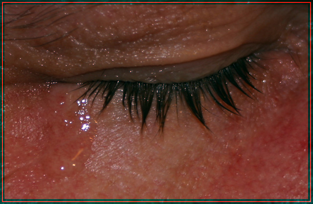
80mm macro + postshot PS6 crop + saturation + grayscale + contrast + resize + sharp + border === a little wipedown with a damp towel + a drop of vitamin E oil = tear-drop
Statistics
Place: 53 out of 71 Avg (all users): 4.8426 Avg (commenters): 4.8000 Avg (participants): 4.7692 Avg (non-participants): 4.9107 Views since voting: 1238 Votes: 108 Comments: 7 Favorites: 0
oops - forgot to enter my "ignore this entry" post before the CC got here - so here goes
as you may have seen on the boards after this challenge deadline came and went, i started the thread "ALWAYS CHECK YOUR IMAGE BEFORE YOU SUBMIT IT" -- i was in PS6, tweaking the red channel on the layers tab, when i got the image looking exactly like i wanted
the trouble was, in that view, the image displayed is b/w (which is what i wanted) - but when i hit SAVE it put all the channels back together - WITHOUT changing the view!!! as far as i knew right then, i had a 'perfect' b/w shot ready to download - which is what i did
imagine my horror when, after the 1st votes started coming in, i saw what people were voting on
Composition - I think first off that this is too tight of a crop. The glistening all over the face is highly distracting. It doesn't look wet, it looks sort of oily and weird, like it shouldn't look like that. The tear itself is pretty believable. I would've left the damp towel off. I think most tears fall from the ear-side of the eye, or at least my kids do. Not being critical of that, just making an observation. Unfortunately this is showing a tear, not really any emotion. What if you called it "dicing onion?" The title would still fit the picture, but not the challenge. I think the tear is associated with emotion, but does not exemplify it.
Technical - Crop is too tight. Lighting needs a little boost. Focus and DOF are pretty good. Looks like you did a lot in PS. Doesn't really show. Which = good job with editing.
Overall - Not really a true display of emotion. i think it would've been more meaningful to have the facial expressions present to sort of justify the tear. Hope this will give you a little insight into what I'm seeing. Good luck in future challenges. - Inspzil
The colors throw me off here. Is the redness just irritation or is it something else? It seems to come across too strongly. The shot, especially the top of the frame, seems overly dark as well. I do like the eye itself though, or rather the eyelid and eyelashes. It seems to me that this is one of those shots that either needs to be closer or farther away to be effective. A closer zoom or crop just on the eye might work well, but pulling back to reveal more of the face and providing more context might also work well. Good luck. 4







 Add photograph to your favorites
 Add photographer to your favorites


