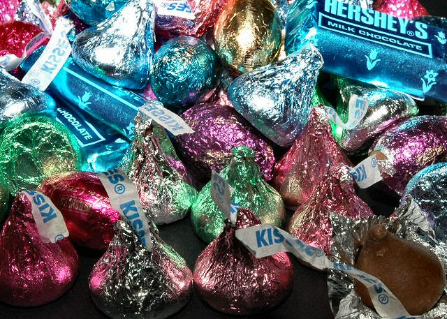
Colorful! Opening the one kiss adds a nice touch. The composition, however, is haphazard. The open kiss draws interest, and then the eye falls out the corner of the pic--a different placement might avoid that. The other kiss that draws the eye is the over-bright one near the upper left--a bit too hot, perhaps. Finally, why not use the flag from the open kiss to advantage, smooth it out and use its lines to help lead the eye.
If you saw this shot without its title, what would come to mind? Aside from that, there is no focus for this image, not to say that the camera was out of focus, but there is nothing that draws the eye to a point. To reuse a critique I received on the light on white challenge, it looks rather like a background photograph for a brochure - something that is used to pep up an article about food.







 Add photograph to your favorites
 Add photographer to your favorites


 Photographer found comment helpful.


