composition is good, the high lights are blown, color balance is off. all affects image color and quality, appears shutter speed little slow........sorry about being critical, hoping to help.............3
The idea is there, but the overexposure really detracts. Composition needed to shift left to avoid pulling the eye to the blank corner and to include the hand which is annoyingly cut off.
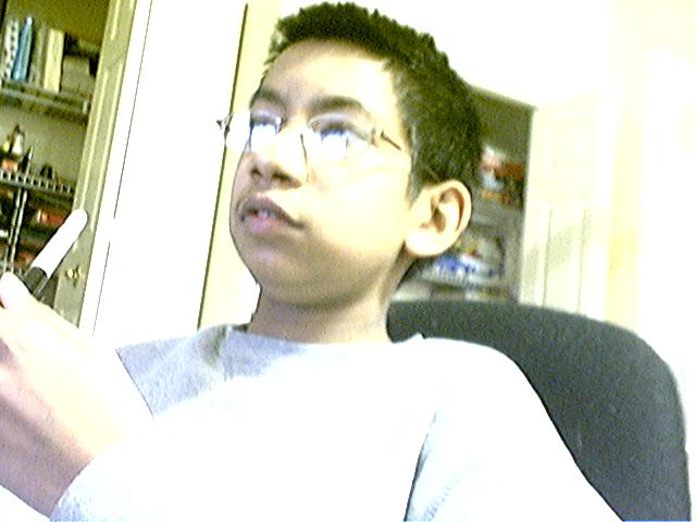
Unfortunatley, just not a quality image. It's overpixilated (probobly due to being resized in correctly....if you need help with that, private message me, and I can give you some advice.) Also, the lighting is very poor (I can help with that too.) and the picture is very blurry (This could also be a resault of resizing.) The only other thing is that your subject dosen't look bored. He actually sort of looks intersted.
Overexposed and it looks like the picture was originally blurred and you tried to sharpen it... it looks overly sharpened. Also, the boy is too far to the left... to much emply space to the right.
The bad:
1. Harsh bright lighting blown out on the shirt, glasses and top right part of room.
2. Focus - the pen might be...
3. Noise - way too much noise all over this show





 Add photograph to your favorites
 Add photographer to your favorites


