Hey congratulations on a good score. I think it shoulda done better. It's one of my faves. I love the old-timey feel. Very nostalgic and mood-evoking! Keep up the good work! -David
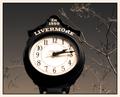
Very nice. I think I would prefer to see more of the stand below the clock, but I like the space used above the clock as well. I wonder how this would look zoomed out a bit. Good use of sepia tone and soft focus.
I like the tones and soft focus here. If anyone tells you the focus is off, they are, in my mind, mistaking out of focus with "soft focus." I hope this image does well.
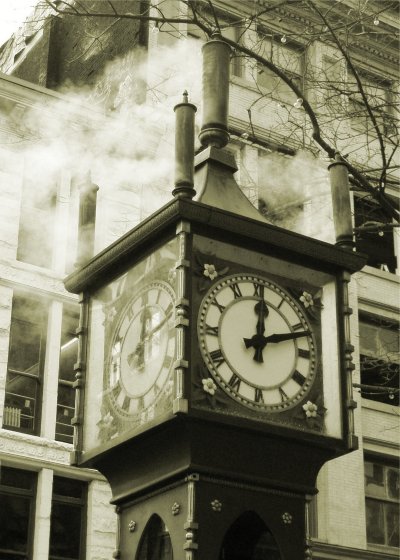
Very nice use of greyskale. To me the clock apears to be leaning to the right but this may be an optical illusion die to the background. Reflections in the left face slightly distracting as are the background windows.





 Add photograph to your favorites
 Add photographer to your favorites

 Photographer found comment helpful.


