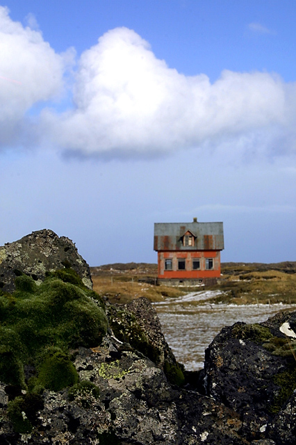
I liked this scene. I think someone else has used it (which is ok of course) but with both shots I personally think that there is too much rock showing. I think that the composition would be improved if about 1/3 of the bottom of the photo were cropped. I also think that it would have looked better if the house were in focus and the rocks out of focus rather than the other way round. I like the way a 'v' shape is cut into the rock to lead the eye into the shot, but with the house out of focus it loses it's appeal for me. Nice scene though.






 Add photograph to your favorites
 Add photographer to your favorites


