Author Thread Comments Made During the Challenge
Post actions
Post actions
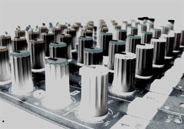
I think this would have been a great shot without all of the wierd post processing. The low point of view is great as is the repetition of objects, but the negative effect just doesn't do it for me.
Post actions
The concept here could have been good. It loses out due to focus and exposure issues.
Post actions
With the grey tone and the very bright areas and dark areas much of the hpto has lost detail
Post actions
A little bit overdone, there's the grey color-cast that doesn't help and the obvious blotch bottom left.
Post actions
Don't care for the colors on this photo.
Post actions
Not very clear at all :( would have been an interesting compostition
Post actions
Would have loved to see it with it's regular colors, instead of inverted.
Post actions
overporcessed for my taste! sorry!
Post actions
would like a simpler treatment of the subject (spot in lower left detracts), subject is a good one for stock photog
Post actions
nice photo but for STOCK the subject should be clear.







 Add photograph to your favorites
 Add photographer to your favorites


 Photographer found comment helpful.


