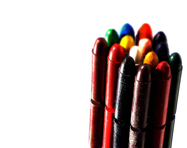
Bunch of crayons organized in a non-organized way. Shot on top of a mirror, with the sky as a back ground. Worked the levels to have a white background.
Worked on the contrast and saturation of the crayons, cropped, resized, USM and safe for web.
Cloned out some imperfections on the crayons, dirt spots and color marks (from the other crayons). Created a second layer, applied gausian blur to it to reduce depth of field a bit.
That's about it! (quite a lot I think LoL)
I was looking through out the house looking for something interesting to shoot! Could only find these crayons! Not a last minute submition, but very close to deadline!
Statistics
Place: 192 out of 258 Avg (all users): 5.0583 Avg (commenters): 5.0000 Avg (participants): 4.8370 Avg (non-participants): 5.3977 Views since voting: 1258 Views during voting: 302 Votes: 223 Comments: 12 Favorites: 0
I didn't vote on this challenge scuds, but I would say you need better focus. If you would have gotten all the crayons in focus then it would have done better. An average vote of 5.0 is nothing to complain about in my mind. It is a good idea. Like I said earlier a little better focus would go a long way here. Also if you would have gotten new crayons then it would have done a lot better also.
i think the image could be improved with a more diffuse light source
and a bit more bounced light from the directon of the camera (a white card or etc )
to many deep shadows (IMO) to be 'kid' friendly
With the shallow depth of field the bright spots on the middle ones is a bit bright. The back ones appear as if you have used them, they look blobish. You set the shot up well, maybe put the object just a bit more to the left. Rule of thrids, here it is more like quarters. Keep shooting
I wish all the crayons were in focus, even if they are not machined to a perfect parabolic surface. And the arrangement of colors seems a little odd. These might be quibbles except the photographer has reduced the photo to just these elements.
Perfect lighting, excellent reflection. To be picky the only thing I would have changed was the arrangement of your colours. The brights ones in the front or less of a red/black mixture might have added impact.





 Add photograph to your favorites
 Add photographer to your favorites


 Photographer found comment helpful.


