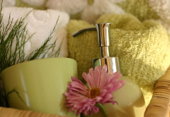
Love the colors but the image could have been a little clearer...the lighting from the right side is so nice, wish you had brought more of it into the basket...
This is done better than most of the still lifes posted, but I would have liked to see a little more of the scene and a more perfect flower (this is just me being picky, but also trying to help you improve) Your lighting is good, I get the feel of morining light coming in the bath window. I would also like to see a little more depth of field. Again better than most of the table top shots. (7)
Call me a curmudgeon, but to me the flower ruins the photo. 1) This particular shade of pinkish mauve clashes with the creamy avocado theme color IMO 2) It's out of focus petals block the shiny metal to which our eyes are naturally drawn. So we resent it's presence doubly. Oherwise I think the photo is a good take on the titled theme.






 Add photograph to your favorites
 Add photographer to your favorites


 Photographer found comment helpful.


