Good interpretation of time. Lighting is a little flat though. Upping the contrast would improve the picture. And perhaps a polarizing filter would reduce the glare on the glass.
Nice image and idea. It seems kind of boring though. It needs something else with it in the photo. Maybe a car in the background or something more to add color.
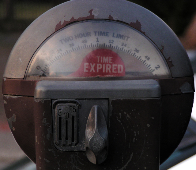
In my oppinion the crop is to tight but I guess there is a reason. How worn out the meter is makes this photo work, it gives the "time expired" a deeper meaning. Good idea but nothing fascinating about the execution or setup (e.g. the busy background, the shadow on the left and reflection on glass). I however often like those point&shoot's better than studio set-ups. A polarizer might have done the trick though.
A GREAT idea, although it may have been stronger had you zoomed right in on the "Time Expired" flag, and without the reflection in the glass. I'm surprised that more people didn't come up with something like this -- good eye!
I really like the 'parking meter' idea, but I think waiting for brighter day and finding a more as aesthetically pleasing meter would have produced nicer results. I find this a bit on the dark side (could be my monitor though).
Why'd ya cut off the top of the meter? Think this photo could have been helped with some more post processing in Pshop.. Not sure what, but something. It's just kind of bland. Maybe jack up the contrast? Play with saturation? Dunno..





 Add photograph to your favorites
 Add photographer to your favorites


 Photographer found comment helpful.


