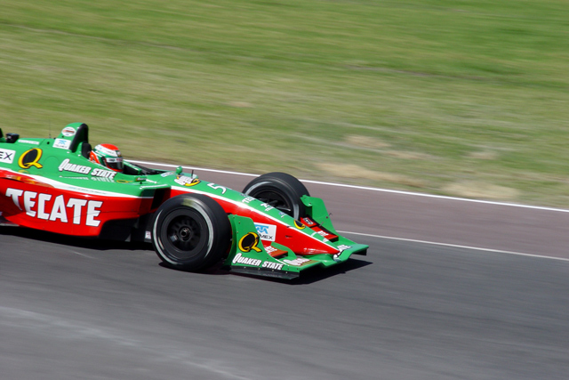
First, for anyone who didn't find this appropriate for "Time", I can't agree. This photo is perfect for "Time", in a much better way than any photos of a clock, watch, etc.. This is an excellent example of panning in photography, which is not always so easy. Very nice colors, focus (though focus not perfect), and lighting (seemed near perfect, but, were you using a polarizing filter on your lense? Seems like some glare could be eliminated). This is only my opinion, and I'm not an expert photographer, but, I didn't like the crop. I don't feel it added anything to the picture, it only subtracted the rear of this car, which, in my opinion, makes the car look slower, not faster. It still leaves an impression of "racing against time", and I think this is an excellent shot! I think you got a lower score (5.1684?!) than you deserved. I noticed alot of voters gave this 3's and 4's, I'm surprised. Oh, I forgot to say that this is your critique club critique.
se ve muy bien. lo único que me gubiera gustado es que la velicidad estuviera representada más dramáticamete, es decir, que no fuera tan rápido el obturador para que inclusive se moviera un poco hasta el carro.
la composición está perfecta y el foco, impresionante.
the blur in this shot brings out the evocation of time well. you're working with a limited pallette here, green and gray. For me, it makes it slightly less engaging. Still, a nice sports shot.
Nice idea, good colours. It's a shame that the whole car isn't in the shot but I guess you did well to get any of it with the speed it was probably doing!





 Add photograph to your favorites
 Add photographer to your favorites

 Photographer found comment helpful.


