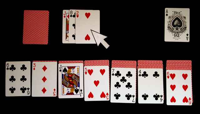
that game is quite boring. i'm not sure why you have that mouse pointer in there? if it was supposed to look like a computer screen why have the black background? if it was supposed to look like you were playing with real cards why have the mouse pointer?
I really like this idea and gave it my highest score. The following is meant constructively:
1. The "mouse pointer" is slightly translucent which distracts the eye and betrays the shot.
2. The top-left of the shot seems poorly lit.
3. Would have gone with a brighter green background to better emulate the computer version. Something like the green felt on a casino table.
4. Might have made the shot 640x480, or something in the 4:3 ratio... again to better emulate the way it looks on a computer.
While I really understand what you mean (I've played solitaire a lot before...), I believe your subject isnt the most interesting and the picture lacks creativity. Apart from that, you have a nice shot.
Nice concept. One suggestion would be to use a green felt underlay, which would resemble the computer screen much better. Also I would have used bristle board or something thicker for the cursor, as you can see the cards through it.
Nice to see someone else who finds it hard to play with the real things without the use of a big pointer. Just needs a grey fuzzy background and a trained cat, poised ready to jump up and throw all the cards around when you get out.
The mimicry might have been improved with slightly more even lighting and precision laid cards. And a slighly lighter background.







 Add photograph to your favorites
 Add photographer to your favorites


 Photographer found comment helpful.


