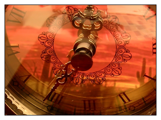
Our neat little clock from our livingroom. A print out of some desert scenery was used in the reflections. I took the picture in the bathroom, so some of the wallpaper ended up in the reflection too. It looks kindof cool, abstract which is what i wanted. I'm not sure how this shot will do. I'm shooting for mid 5s maybe - hopefully more.
Statistics
Place: 10 out of 209 Avg (all users): 6.2872 Avg (commenters): 8.0500 Avg (participants): 6.3393 Avg (non-participants): 6.2169 Views since voting: 1880 Votes: 195 Comments: 23 Favorites: 4 (view)
COMPOSITION
The composition of this is really strong. You have filled the frame with the main object, and your subject is easily identifiable.
TECHNIQUE
The colors here are wonderful. The orange of the desert scene really complements the brassy/gold of the clock hands. Also, I like that the hands of the clock are so well focused. It gives the eyes something distinguishable to "rest" on. Choosing a desert scene, such as you have, works well because the reflection does not have to be in focus to be identifiable. Being slightly "soft" adds to the overall warmth, I think. My only suggestion would be to reposition the hands. I think the "short" hand needs to be more around the 11 or 12 (a normal 3 o'clock position, but I see your clock is on its side), and the "long" hand around the 6.
OVERALL EFFECT
I did notice the tiled in the background in voting, but it wasn't too distracting. If you wanted to eliminate it, possible laying a similarly colored towel or cloth down may have helped to "disguise" it. Otherwise, it adds some "surrealness" to the shot, and makes the viewer stop and look a little more.
Maybe it is the reflection of the desert sunset and what appears to be a scrabble board in the clockface, but I realy like this image. It has an interesting combination of color and good clock clarity







 Add photograph to your favorites
 Add photographer to your favorites

 Photographer found comment helpful.


