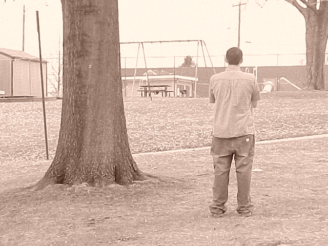
Nice approach to the subject. In my opinion, sepia tone works well in putting forth the feeling of late winter, but would benefit from a bit more saturation; sky seems a tad overexposed; sharpening effects are a bit too pronounced in the branches and trunks of the trees.... but just my opinions!
It's pretty clear, but on the harsh side. It seems to me that the contrast isn't strong enough. Without the title, this photo could represent many thoughts - "he's mad at you and not talking to you sort of thing", to "what is he looking at?" 5 Swash
A nice idea, but I have issues with the technical aspects. It looks like camera quality issues, which is a shame, but the background surely didn't need to be so confused.






 Add photograph to your favorites
 Add photographer to your favorites


