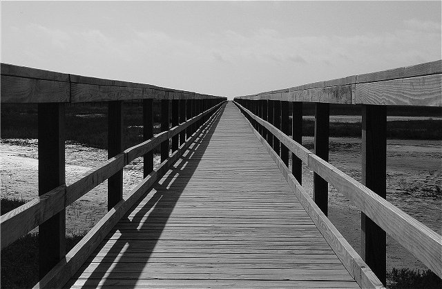
If the wood was "yellow" I would have used more of the red channel in my conversion to try to make the wood brighter and the sky darker. You've got excellent depth of field and good dark shadows, but the wood just doesn't stand out as much as it could. The "grays" feel "monotonous" rather than deep and dynamic. Love the composition. 7
This definitely has some impact. The contrast is nice. I just wish the sky were dark and filled with puffy white clouds. That would put it in the running.
No lines visible - doesn't meet the challenge. Poor exposure, out of focus and lacks clarity, detail and DOF is way too narrow. Light is flat and dull - this shot's going nowhere. Better luck next time loser.
: )
Line me up for a ribbon. No color to distract from this line extravaganza. Excellent choice of black and white. My third 10 this challenge. Congratulations. This is a contender.







 Add photograph to your favorites
 Add photographer to your favorites

 Photographer found comment helpful.


