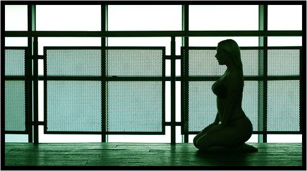
Taken at a photoshoot in the student union of one of the Halls of Residence for Leeds University. There were loads of models and loads of photographers... everyone had missed the potential of this great background until I spotted it near the end of the day.
Taken with my 50mm 1.7 Minolta lens.
I'll supply the name of the model when I've checked it with the organiser.
Statistics
Place: 11 out of 338 Avg (all users): 6.4803 Avg (commenters): 8.4000 Avg (participants): 6.4675 Avg (non-participants): 6.5067 Views since voting: 5042 Votes: 229 Comments: 36 Favorites: 23 (view)
This is a truly great shot, and the green to grey transition is truly perfect. There is a rythm to this shot that would certainly be missed by the untrained eye. There is no pretense here either, just nice tone.
Although I am giving this one a 10 already, I feel that the image could have been far superior if she has been wearing a white ghi or white robing. The contrasts would have been much more striking.
One of the few pictures that exploits the lines at it max. The contrast between the cold straight lines and the warm curves is absolutely fantastic. Very good work - 10
Fantastic composition. The frame itself feels like the enclosing walls of a small room. The almost silhouetted presentation of the model works well. I like the green tones. And lots of wonderful lines and textures.
Very sensual compared the the "sensual" photo I just voted on. Great lined background. Wavy body shape outline being the focal point very distracting. It seems to remove the lines to the background if not for the 2D effect of the shadow photo. Thanks 6.
Lines and Curves. It's very moody and atmospheric. Somehow I think I should love it, but it's not happening for me. Maybe it's the green. Or maybe the stark right angles. Or maybe it's the fact that the two structures have incompatible vertical rhythms.
I would love to see this image at a larger resolution, I thinks its moire? because of the size. The purest dipiction of lines I've seen thus far, excellent shot and may I suggest this is a ribbon winner.
I love the composition of this a lot. The contradicting straight lines and right angles vs the curves of the female form are very interesting. Sort of like the yin and yang of architectural styles, total opposites yet both have their place and can both be aestheticlly pleasing. The only thing that bothers me is the green tint. I think this would have looked better as pure b/w or maybe even sepia but I'm not too keen on the "Matrix" style coloring. 8







 Add photograph to your favorites
 Add photographer to your favorites

 Photographer found comment helpful.


