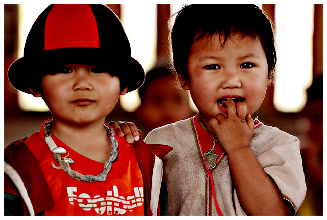
Heh :) I know the editing isn't good on this one. I edited it in a hut with no power or lights on my laptop. Didn't want to take too much time to preserve battery life. It's prolly the worst of the shots of these kids, but the one that spoke "Best Friends" to me most. The DOF was too shallow so the tyke on the left was a bit blurry. At home I might have been able to fix it. As it was...not so much.
I still love it. These kids were adorable.
Statistics
Place: 35 out of 242 Avg (all users): 5.8735 Avg (commenters): 7.9375 Avg (participants): 5.6627 Avg (non-participants): 5.9461 Views since voting: 1305 Views during voting: 435 Votes: 324 Comments: 19 Favorites: 1 (view)
Knew this was yours. Great shot. I think the redness hurt your score a lot here. For me, it works well, as the red plays a major role in pulling the image together, but the red in the skin tones and shadows is a bit much, especially under the eyes of the kid on the right. I think a black and white version would have scored higher despite losing the impact of the color theme.
Hmm... Thai kids, Spanish title, same muted colors as a certain Wisdom photo... hi, Pedro! I have a similar reaction to this photo as your Lines portrait- the models and composition (less so on this one) remind me very much of Librodo, but the colors and lighting just aren't the same.
The lack of shadow detail isn't Manny's style, and the colors remind me of when I had my camera set to an Adobe RGB color space. It's a good photo, and should score fine, but ya' gotta find a way to bottle some Librodo and bring it back home. Of course, if this turns out to be his, I'll be going into hiding for a while. ;-)
Oh yeah, they look like they're up to something!!! Background is a little blown out and I wish you hadn't cut off their heads, but all and all I like it!
After looking at other entries, I bumped this to a 7. Good colors, focus, composition, pov. The whites in the background are a little harsh. will pass again.







 Add photograph to your favorites
 Add photographer to your favorites

 Photographer found comment helpful.


