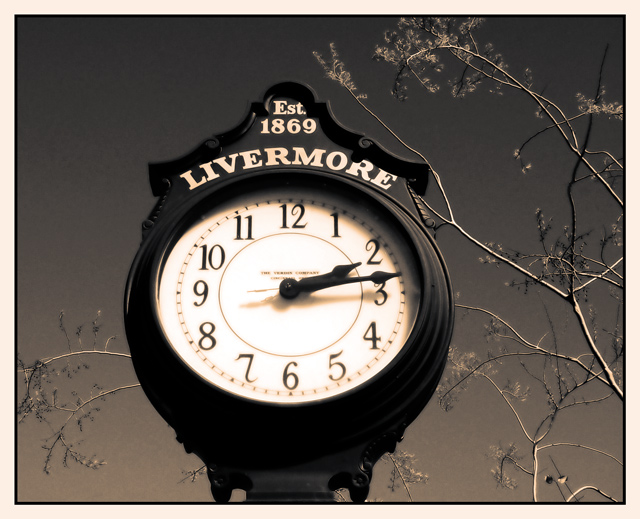
I adjusted: levels,curves,saturation. Then I created my own Tritone and applied. Cropped at 1.25:1 added a border and saved for web. Actually the full color one is nice too... it was a hard decision.
Statistics
Place: 22 out of 209 Avg (all users): 5.9031 Avg (commenters): 7.7333 Avg (participants): 5.8929 Avg (non-participants): 5.9167 Views since voting: 1274 Votes: 196 Comments: 16 Favorites: 1 (view)
Composition - Color tones are great. They really add a lot to the shot overall. I love the "glowing" leaves on the branches, an equally great effect. This has a 60's look to it I think. The branches work well to show some depth to the pic. My biggest qualm with this pic is that the bottom half of the clock is not really well focused like the top half. Not sure why, but thats how I see it.
Technical - Extremely well taken. Good DOF, exposure is great, just a touch soft on the focus on the clock as I said above. The biggest, best difference in this photo is the remarkable job you did adjusting color, levels and making it unusual in terms of tone, but familiar in an eerie way. Very well done.
Overall - A nice strong image. Not too dynamic, but a soild composition backed by some awesome editing. Very good work! Good luck on your future challenges. - Inspzil
Simply wonderful tones here. The sky is fabulous, but what really makes this image effective to me (the frosting on the cake) is the way the lacy branches echo the lettering of the clock. Delightful to look at. High marks from me.
I like this shot but the bottom of the clock is out of sharp focus. It would have had greater focus to shoot it head on instead of from below. Good exposure and a perfect shot for black and white.





 Add photograph to your favorites
 Add photographer to your favorites

 Photographer found comment helpful.


