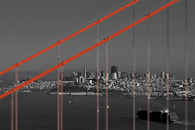
This is a tremendous image in composition. The lines are beautifully used throughout. The selective desat looks as though it has had some bad results in the small vertical cables, which look blotchy halfway up on the right. If not for that, I believe you'd have a very highly placed photo.
This is a good concept, I like it a lot. I think the red of the wires is just a little too red, they do have to stand out but I think they would if they were toned down just a bit
hmm... Not sure if I think the selective desat works here. Since parts of the city is included, it looks kinda weird. I'd like to see it in color, with some extra saturation on the red channel, possibly.
This meets the challenge and is well-composed. I don't think the bridge cables needed to be red - it's the only thing that detracts from this photo for me.
most likely, the orange is acurate, but pulling it out of the picture by desaturating everything else does nothing for the image, aside from making it jaring to look at. I don't think it was necessary for this piece that otherwise would have been wonderful, I'm sure.
Perfect! This is so incredibly striking! I would say good luck, but I don't think you will need it. Your subject and execution takes away your need for "luck" :) 10
I see what you were trying to do, but I don't think it worked. With advanced editing rules, there are better ways to selectively desaturate, like using the healing brush to paint the red back in.






 Add photograph to your favorites
 Add photographer to your favorites


 Photographer found comment helpful.


