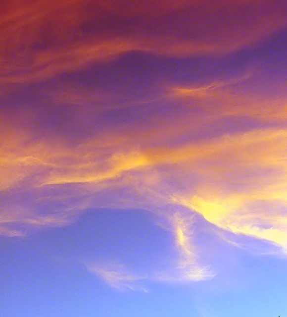
A great shae that you couldn't do anything about the very blotchy noise in the upper part of frame. There is a sense of grace here, but mostly for me it falls too much into the area of the abstract, and not particularly striking with it. The tones are fine though - well represented. One point - the tiny little bit of skyline(?) showing bottom right could surely have been dealt with.
Lovely colors! --though a bit blotchy. You might try shooting at a lower ISO to avoid this, even if your photo ends up being initially too dark. When you lighten it, it will be less blotchy. You can also select each color (with a nice feather to the selection) and do some various blurs (gaussian or motion) to eliminate the blotches. Finally, you can also try selecting each color, take a 5 px by 5 px color sample, and actually paint the color on with, perhaps, a 50% opacity to the brush--OR you can even use the fill tool at a certain percept opacity. Nice composition and an interesting abstract. Good luck! 6




 Add photograph to your favorites
 Add photographer to your favorites


 Photographer found comment helpful.


