"The Penrose triangle, also known as the tribar is an impossible object. It was first created by the Swedish artist Oscar Reutersvärd in 1934. The mathematician Roger Penrose independently invented and popularised it in the 1950s, describing it as "impossibility in its purest form". It features prominently in the works of artist M. C. Escher, whose earlier depictions of impossible objects partly inspired it.
The tribar can only exist as a 2-dimensional drawing, since it exploits the overlapping of parallel lines drawn in different perspectives. It appears as a solid object, made of three beams of square cross-section. All the beams are mutually perpendicular, yet join to form a triangle."
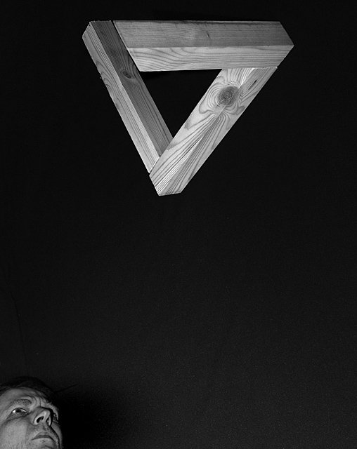
My take on the Penrose Triangle, its a pity my score won't include the work on this project. For those that missed the point of this, I worked out 'how to' then built and photographed an impossible 3D triangle (hopepefully well enough to pass). I had big plans to set the triangle against a sky backdrop but a) didn't have the sky and b) when it came it ruined the shot.
Eventually shot on the floor indoors with no wires or mirrors ;)
Statistics
Place: 72 out of 338 Avg (all users): 5.8519 Avg (commenters): 7.1818 Avg (participants): 5.7655 Avg (non-participants): 6.0282 Views since voting: 2017 Votes: 216 Comments: 21 Favorites: 3 (view)
** Hello from your fellow Critique Club members **
Composition I definitely like the placement of the triangle with the point oriented downward. Not only are there distinct lines in the triangle, but the point leads to another line, one that ends at the bottom of the photo. The person in the lower left is interesting. I'm not sure if it makes or breaks the composition. The face doesn't go with the triangle, but at the same time nothing would result in too much negative space.
Technical This photo is well lit, exposing the texture of the wood. Perhaps though a little more lighting for shadows would bring out the three dimensionality of the triangle a little more. The only issue I find is that too much of the background is visible and would be better if it was nearly black.
I like it. I think there is also too much space between the triangle and the viewer. I like the look and I like the fact that the in kinda cut off. Anywhere else for you in the photo and it would not have as much punch. Good work.
Sometimes DPC voters leave me in wonder. This is a great image and somehow under appreciated. Well, I am highly impressed and thank you for presenting this mind teaser.
You depicted the reality and illusion of "Lines" with ingenuity and excellence; congratulations on the thought, the construction, and the photography of an outstanding entry; yours had my highest vote and should have been in the 7's IMO. Regards, Dave
very well done
the only way to improve on the image would be to taper the wood as it moves around the Penrose triangle so that the effect of the perspective was not so pronounced ie. that the end of the top beam was made smaller so it fitted the scale of the rear piece where they are meant to meet (but don't)
Very creative idea, espcially for a challenge called lines! Adding the perplexed viewer is a stroke of genius. Great framing. Kudos to you. I might have reduced the space between the viewer and the viewed but definitely made the background jet black.
Nice one. I like your approach. It's a great image, but I you could crop from the right to balance the composition by creating an edge to edge tension. Cool stuff.





 Add photograph to your favorites
 Add photographer to your favorites

 Photographer found comment helpful.


