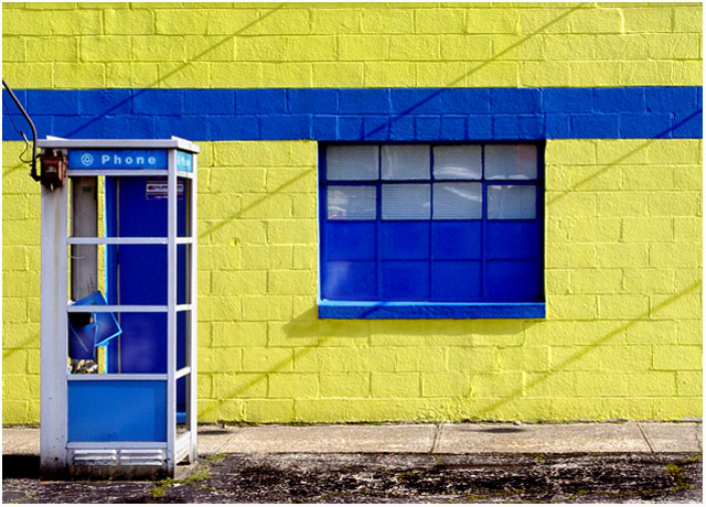
A reshoot of a photo I took the Sunday morning before the "Lines" challenge began. (figures!) Shadows aren't quite the same, but I still think it's a pretty strong entry for lines.
Not only the visual lines of the building, shadows, sidewalk and booth - but the term "land line" applying to the telephone booth as well.
In our town, these enclosed type, free standing "Superman" phone booths are pretty much extinct. I didn't even know we had one in town until I drove past this one a while ago.
Statistics
Place: 37 out of 338 Avg (all users): 6.0814 Avg (commenters): 7.3000 Avg (participants): 6.0878 Avg (non-participants): 6.0685 Views since voting: 1264 Votes: 221 Comments: 33 Favorites: 1 (view)
Am glad I found this shot again Judi, its simple, clean and (honestly) I've just scrolled down and found my original comment that said the same!I still like it and my first comment still stands.
I didn't realize this was your shot. I love this. Feels good to get a decent shot out of your comfortable norms doesn't it? The colors and textures are very compelling to look at.
This is really cool - the colour of the building, the appropriateness for the challenge, the framing, the texture of the brickwork, the contrast between the yellow and the blue of the building and the blue and white of the phone booth. This one deserved the good placing, if not better.
I love this! Color blocking to make an abstraction of something people usually just walk by is one of my favorite type of images! The diagonal shadows really make it dynamic.
Did you reshoot this photo once the challenge was announced? Since we critiqued it long ago.... Definitely not as crisp as the one I saw before and I believe the angle is just lightly more to the right than the one I saw - about 1/2 step or so ... let me know
This is one of my favorites of the challenge. Very simple on the surface, good and stark colors. The diagonal shadows provide a nice contrast to the right angles of the lines in the building, sidewalk, and phone booth. You might have wanted to rotate the canvas just a wee bit clockwise.
I love the color palette. The background is perfect fo the subject.
I wish that blue door weren't there. Or that the camera placement would have caused it to fill the space between uprights. It would be the merest quibble, except that the shadow lines direct our eyes to the phone booth and when we get there, it's cluttered up by the background.
Love the vibrant colors here. The shadows cast by the telephone lines (I think) are a nice contrast to the horizontal lines of the wall. Overall, image seems a bit unfocused. Clear details of the wall and telephone booth seem to be lost. The top edge of the bricks appear to be tilted towards the left or counterclockwise. Maybe the wall isn't even or level.
I hope you went back to reshoot and this isn't someone that knew the location? I've recalibrated my monitor but the yellow seems lighter in this shot. Simple, crisp and clean lines. Imho I think cropping up to the pavement would make this shot better.







 Add photograph to your favorites
 Add photographer to your favorites

 Photographer found comment helpful.


