I had this perfect idea for the Surrealism challenge, involving a few friends, medieval armors, masks and some funky blood... but overall, i found that it slowly went away from the 'surrealism', but more into the 'Fantasy'. So, at midnight, as my friends were leaving, i decided to reshoot something that would look more conservative and 'surreal' for the challenge. And this is what i came up with!
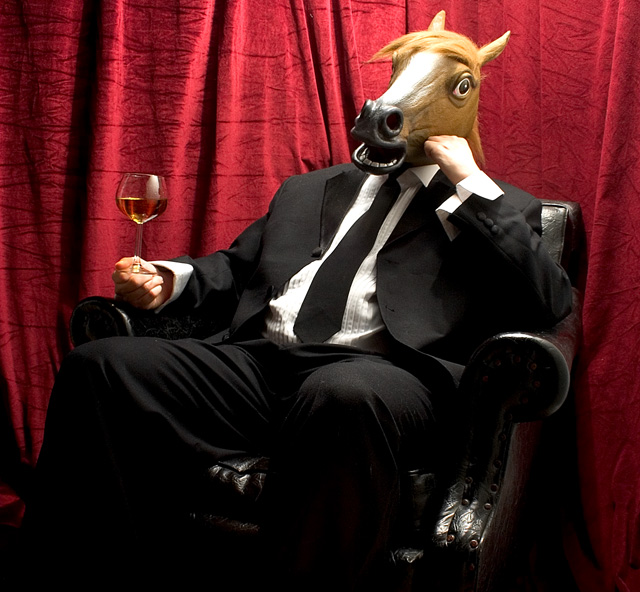
Spent about 25 minutes setting up the shot, from getting the seat from my bedroom, to setting up a single 500w lighting bulb with umbrella (i so wished for a softbox grr) over the my friend's horsy head, took some real rhum as i didn't have any icedthe or something similar and did a few tests. Then dressed up the friend in my Mariage tox (no, not my marriage) and snaped a few thingies here and there.
Levels, sharpness, Hues and contrasts to the shot.. then a squary crop.
Enjoy!
Statistics
Place: 22 out of 271 Avg (all users): 6.2172 Avg (commenters): 7.6818 Avg (participants): 6.1712 Avg (non-participants): 6.2366 Views since voting: 1915 Views during voting: 654 Votes: 373 Comments: 30 Favorites: 1 (view)
Antoine: just want you to know that this is a great image and one that should have finished in the top 5. Certainly beats my attempt because you approached it from the angle of sheer humor and the image is just great. As a matter of fact I am placing it in my favs.
Overall, interesting and technically sound shot.
As far as ways to improve the shot, lighting could've been more dramatic by making the light from the side instead of the top.
One thing I find weird is that the horse's hair looks out of focus on the top of the head. Probably because of the lighting making it a little overexposed though.
Would've also been nice to have a lower source of light to see the legs and see a little bit more of the chair's material since the leather has a nice texture.
I think this photo should rate the highest in your submissions and is also one of the few who in my opinion, respects the challenge's theme.
Great idea to revive and reverse the classic Centaur theme- this horse sure knows how to enjoy life! Technically nearly flawless photo- however, the unidirectional ight seems to bleach the top portion of the frame, it disturbs the elegance of the surrounding and classiness of the subject. A++ for clear idea, good use of elements and composition.
Definitely in the challenge. A little politically subversive, perhaps? The strong lighting is both its strong point and its weakness. It flatters the background; I love the curtain. But it both forces blown highlights in all the white materials and huge flat areas of blackness in the dark leather and clothing. Without these flaws, I think this could be a solid contender for a top spot.






 Add photograph to your favorites
 Add photographer to your favorites


 Photographer found comment helpful.


