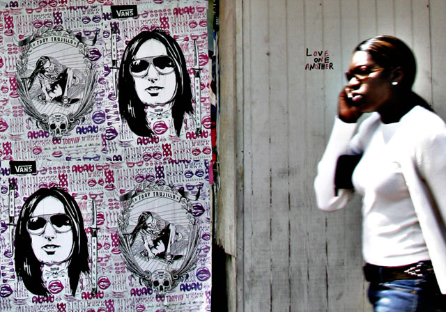
Having some trouble getting used to real lenses. And the difference between in focus and out of focus over very small distances. Guess I needed to be around a f/22 to improve the problem. So she was way more out of focus than I wanted. Did an unsharp mask with a 40 Radius. Liked the halo effect created around her. I also really like the sharpness of the lettering against her fuzziness, it almost floating off the pic, but I'm thinking this pic is a really aquired taste (and maybe one only aquired by me). Big crop for the composition to be focused around the lettering. Adjusted curves to bring out wood grain and intensify the girl. Upped saturation a bit.
On a deeper level, the inscriber and his true intent were unknown, but for me the piece was designed to be a plea for societal harmony from a pair of disparaged groups (skaters / black americans). Though I do realize that does become a stretch, since the pictured actions of the symbol chosen for each culture don't really strengthen the concept. Strangely they also share some commonality in the type of glasses worn, which I found very odd for an extremely random picture. That was my "Inner Beavis" talking. Perhaps the concept needs to be revisited on a less forced creation.
Statistics
Place: 147 out of 271 Avg (all users): 4.9167 Avg (commenters): 6.5000 Avg (participants): 4.6250 Avg (non-participants): 5.0410 Views since voting: 1244 Views during voting: 525 Votes: 348 Comments: 8 Favorites: 2 (view)





 Add photograph to your favorites
 Add photographer to your favorites


 Photographer found comment helpful.


