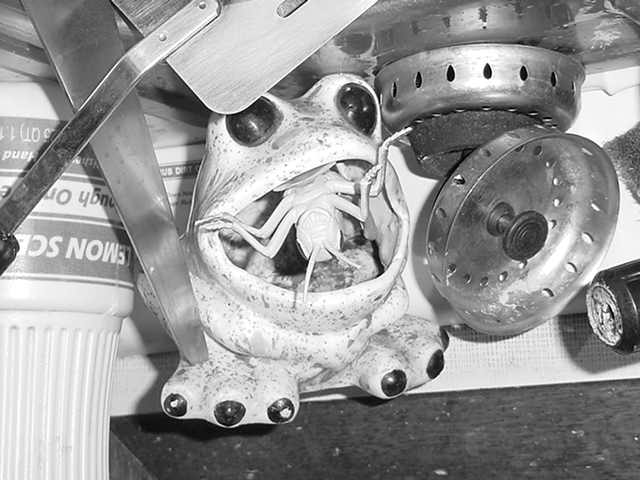
Everytime I looked at the thumbnail on this one, I wondered why I voted it so high, and I had to continually remind myself that is was much better bigger. My only suggestion would be maybe a bit more of a crop to remove some of that "dead" space at the bottom of the picture. Hard to do without losing some of the other cool stuff at the sides -- unless maybe you went with the 640x427 image size...
What I really like about this picture is that some of the items are upside down, and some are not so the viewer's head starts spinning. Black and white work well, because I assume it was very colorful and all of the colors would have been competing for attention.
Forgive me, I'm going to be pretty harsh. There seems to be a lack of control over the photographic process. The subject is unclear and the scene is cluttered. The contrast is nice, but the lighting a bit harsh. These are only my opinions, please don't give up. The idea was a creative one.
I like black and whites... this is a neat entry to this challenge too... i think your light source may have been a tad bright for this one. maybe a little negative brightness and positive contrast adjustments would have improved the overall result. Nice work!





 Add photograph to your favorites
 Add photographer to your favorites


