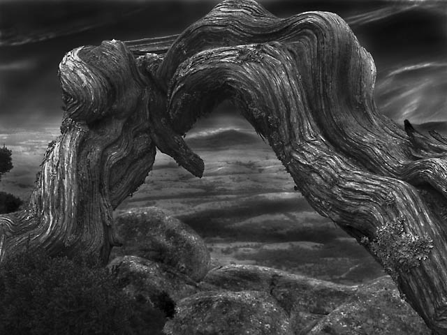
Very cool image. I would have liked a bit more sky at the top where the branch is just a bit cut off, and I would have liked a bit more variety of tone. Even just as it is, I like it alot and gave it a 7 in the challenge.
A very interesting study which would have faied much higher with a simpler background. The homogenous tones interfere with the spatial distance. It is good to sharpen a branch but care should be taken not to give it a metallic look. After all these comments, the image remains impressive because of its sheer display of strength. Bumping up.
One of the two of my top picks for this challenge. Not only does it have an interesting contrast between light and dark but also (and perhaps more dominant) the natural wooden arch in front vs the landscape behind it.
A lovely subject spoiled only by too much prominent editing. Tonal range is not broad enough (too much mid grey) for an AA, but the subject would have been convincing if you hadn't lost the top, which is a real breaker for this image. I love gnarly would like this and I'd love to see it re-shot without the special FX and a more dynamic range.
One of only two 10s
Truly spooky in a Sleepy Hollow way. Fantastic detail on the bark. I really don't find the lack of detail in the rolling landscape behind as it only enhances the mood. Burning has ben artistically done..especially the hill in the apex of the arch which makes an eye and pulls the eye in a clever fashion. I think, in truth, Ansel didn't delve into melancholy like this, but that's defintiely our gain here. Added to favourites.
This is such a cool subject and a nice composition. The image seems a bit soft and would probably benefit from some more dodging to provide contrast against the dark areas, but I still really like this photo as it is. Great job!
This is a strong and eerie image, but it's really hard to figure out what's happening under that arch. Almost has an underwater feel. Much study leads me to believe that's a landscape of hills and trees under there, but I have to reach roo deep for it. If you had worked to separate the distant landscape from both the sky and the foreground rocks, by lightening it and adding contrast at same time in that area, this would be much more coherent. As it is, ALL the elements of the photo are so close in value that it's hard to perceive the depth that is obviously there. Also, the truncation of the arch at the top is most unfortunate... Still, a strong and evocative image.
I like the originality of this, especially as I am a sucker for dead trees, driftwood etc. Maybe a shade on the dark side (in the centre), but a great shot otherwise.





 Add photograph to your favorites
 Add photographer to your favorites


 Photographer found comment helpful.


