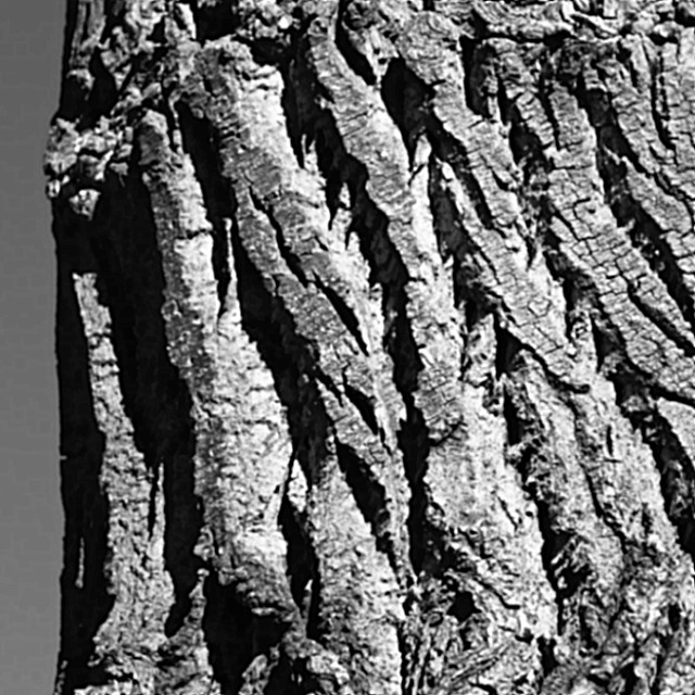
The picture as done in the link is much better. I don't dislike the first, but I must agree that it's out of focus and the sky was detractive (it took me a second to figure out what that grey thing was). The idea, bringing out detail, contrast, and texure, was very Ansel Adams, and I would have allowed a few points for that, and a few because I overall like the picture, minus the obvious flaws. I probably would have marked you a four on the first, and a seven on the second.
I'm surprised at so many 1s and 2s. I always reserved those for shots that make me say to myself, "Now what in the dickens was that photographer THINKING when hitting the shutter on this one?" This includes irrepairably technically horrendous stuff, 'what the heck does that have to do with anything' subjects (not simply 'well, it's a strech, but I see it'), or any other things that make 'One One One' or 'Two Two Two' flash in my head. Yours didn't. I could clearly see your aim, what you were thinking, and I feel it hit the theme right on the nose. Yes, there were some major technical flaws, and points needed subtracted for that, but was it a terrible picture? No. Brown Ribbon? I wouldn't have thought so.
-Annette
to those of you that commented, you're all right. There's something wrong with the way I'm reducing and editing images, either in the workflow and/or the software. I'm looking into learning a better workflow.
Above link goes to the crop and detail that I wanted to see in the image, hopefully this would have scored better than the brown. It's twice the pixels, and the only thing that's been done with it is a slight curves, and convert to greyscale, then 1:1 cropped to 1280x1280.
I just dont see a need in voting anymore .... I tell ya I didnt but it if I had I wouldnt of gave it anyless then a 5. In fact thinking about Adams work and his history in photography this would of been one of those test images that noone would of seen for the comparison between b&W... I guess not everyone thinks like that. Better luck next time.
This absolutely had to be well focused to be successful and, unfortunately it isn't. You had a powerful, well defined subject here, so it's a shame that you weren't able to improve on the result here - unless you've cropped into a very large shot?
Can't get much closer than that! Seems a little out of focus and there is no one place to draw your attention except the flat grey on the side. I can tell the texture isn't flat but the picture appears kind of flat.
Revisiting and explaining my lower scores - I hope to be helpful, not insulting.
I only rated this a 4 because it is very out of focus on my monitor, and I can find no evidence that Ansel EVER allowed OOF areas in his photos. Sorry :)
Got the proper adams style high contrast image. The picture is not in good focus and there appears to be some strange type of noise on the left of the tree.
I really like the shadows and highlights you captured. However, there doens't appear to be any point in the image that has a strong focus. Also, the extra negative space is distracting because it isn't large enough. I find (and this is just a rule of thumb) that you should either have your subject take the whole frame, or allow your negative and positive space to take up thirds on the page. The negative space should take up at least 1/3 of the space. Sometimes it can take up 2/3 if it really enhances the subject. Here, it takes up 1/8 of the space or so.
At first glance I liked this, but with closer inspection, my eyes seem to go blurry looking at this. I'm trying very hard to find a part of this image that is in clear focus. There is a great deal of loss of detail in the highlights as well. <4>
This may be intentional to make the image look old but I would have prefer a litle more sharpness. Represents the texture well but I can´t say I find the image very original or interestin.





 Add photograph to your favorites
 Add photographer to your favorites

 Photographer found comment helpful.


