Critique Club
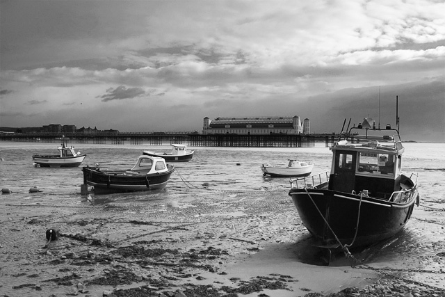
Wow great shot, one of the better in the challenge. Your tones are GREAT, you nailed that. I am jelous that you had a chance to photograph this and that there is nothing like this where I like, anyhow good eye. The only think I could suggest that may improve this shot is cropping out some of the sky. I think it is more dramatic to place horizons either in the top third or bottom third. In your case it would have to be the top third. I think that by placing it in the middle you are splitting the picture in two. Especially with the dominat pier in the back. By decreasing the amount of sky it should help draw the eye to the boats. Great job and keep up the good work
Thanks for all the kind comments. This wasn't shot specially for the challenge - I happened to be at a family get together that weekend and decided to take an afternoon shooting the seaside. This was my favourite of the day.
I have since re-done the B&W conversion on this image and controlled the highlights and lowlights in the sky much better. I'll use the better version for prints.
A unique capture. Like the tonal ranges. Good composition of the arrangement of boats. The building creates both a nice perspective. Good luck with this excellent emulation of AA's style...
Rich and serene. there's much to admire here. a couple comments: The POV would be better if placed so the large boat and the end of the pier don't dovetail so precisely; a little to the left and a little lower, with the camera, ought to do it. Also, the pier's been leveled but the horizon is falling off and the the structures on the pier are leaning over likewise. a quarter or hald degree ccq rotation would help immensely.
The sky could be contained better upper right and upper left both, also.





 Add photograph to your favorites
 Add photographer to your favorites

 Photographer found comment helpful.


