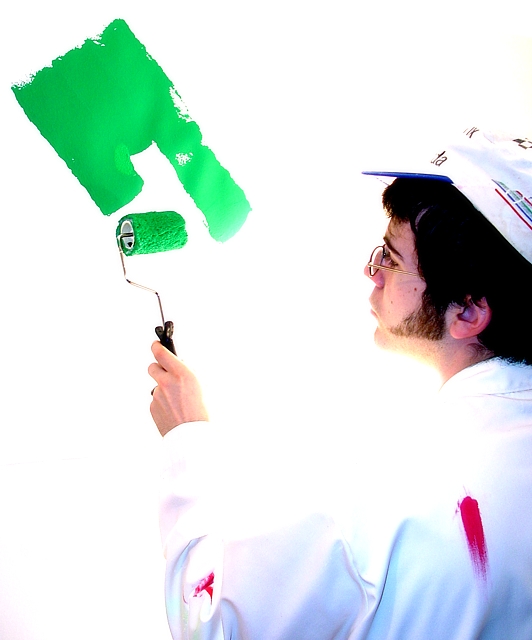
Great idea and really good composition. Unfortunately I fear that you will be marked down by many because some of the highlights (eg: the subject's Shirt) are overexposed. The challenge guidelines stated to be mindful of this. I like it though, good work!
I think the green on the wall draws the attention away from what the subject should be, the painter in the light suit. Although, it is a farely light shade of green, so I am not voting you down for that, just thought I should state my opinion.






 Add photograph to your favorites
 Add photographer to your favorites


 Photographer found comment helpful.

