Greetings from the Critique Club
By Inspzil
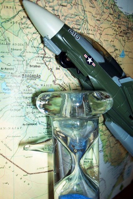
Composition - The general composition of this photo seems to be more of a political statement for this time in history than a real photographic or artistic statement. It has no real flow to it. But we all understand the significance of the statement in real world terms. In photographic terms though, these 3 things just don't really go together. The photo looks to be taken with flash which has partly washed out part of the map and cast some harsh shadows behind the hourglass. I think the full hourglass should've been shown here. The hourglass is pretty neat though and I bet you could get some cool effects shooting thru it. For this picture, it doesn't really work for me.
Technical - First off is the lighting which I already mentioned. The second is a fairly shallow DOF which makes part of the map under the plane and to the right of the hourglass pretty blurry. The photo is pretty clear, but not totally.
Overall - I can understand why this particular photo was made. In photographic terms, it doesn't do much for me though. The composition of the photo, no matter how well framed or lit, would be difficult to properly portray "on film". Whatever the case, you are correct in saying this was not well executed and even if it were, I don't think the composition lends itself to scoring well. That being said, I will tell you good luck on your future challenges and bid you good day - Inspzil |





 Add photograph to your favorites
 Add photographer to your favorites

 Photographer found comment helpful.


