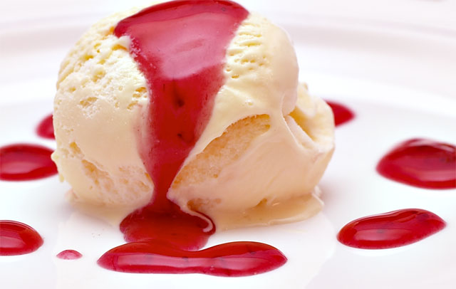
The red is way harsh to be a "light" color, but it's a great shot. Could have been just a little more room above the scoop to get more symmetry to the shot. 6
Thanks you've summarised what the consensus for what I did wrong in this shot.
1. Too bright for light, perhaps leaving off the topping would've been better
2. My cropping was too tight, this unfortunatly was due to the prop (plate) I had very distracting pattern around the rim which I felt confused the image so I... Lesson: Get good props :-)
10 for pretty, 10 for originality, 100 for delicious = 120! Oops sorry, Its only 10 what i could give you, so 10 would be GREAT. Really good photo and different. I like it very much!!!!! :)
The red is way harsh to be a "light" color, but it's a great shot. Could have been just a little more room above the scoop to get more symmetry to the shot. 6





 Add photograph to your favorites
 Add photographer to your favorites


 Photographer found comment helpful.


