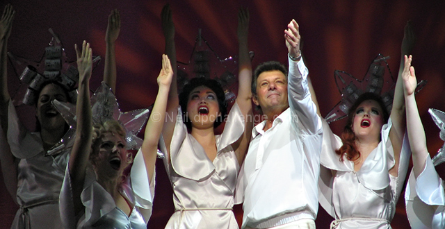
I was not going to submit to this challenge, but I Went to Grease today, took some shots of the finale with Frankie Avalon, and managed to catch this with my little Canon S1 IS. I liked it enough that I wanted to submit it!
Thanks for those who commented. I was a bit surprised how many people must have dinged me for the cast that's not in the spot light. They call it a spot light for a reason--it's for the stars. I could have cropped the others out but I thought the variation in lighting was important to the 'star' effect (broadway star that is).
Statistics
Place: 69 out of 148 Avg (all users): 5.5268 Avg (commenters): 5.5000 Avg (participants): 5.4318 Avg (non-participants): 5.5983 Views since voting: 1606 Views during voting: 350 Votes: 205 Comments: 10 Favorites: 0
Heh, I thought this might be yours. I didn't have a problem with the dim cast members (for exactly the reason you described). Nice job- gave it an 8. ;-)
ok, i am voting this challenge in 2 passes. in this pass, you will get a partial comment and a score. then i will come back to comment again. if you have any problem whatsoever with this comment, pm me and let me know. otherwise, take it with a grain of salt...i'm not trying to be a know-it-all, i'm just explaining where i'm coming from in voting this challenge. and, if this comment is NOT helpful (of if you think i'm full of $#!+), don't mark it helpful.
billboards are a science unto themselves. a lot of research has gone into determining just how much information a person can digest and retain in specific time spans. they use this information to develop formulas for determining the number of words and letters to use on billboards, as well as their sizes. they also determine the size and number of visual elements to include.
the graphics/photograph on a billboard are designed to get the point across in a moment. on the road, a driver will have less time with a billboard than a voter will give your image. this is a key element in the challenge: composing a shot that will get its point across quickly and succintly. along those lines, a strong composition will probably have few details and make strong use of negative space.
-------------------
excellent shot! i've seen many billboards just like this leaving philadelphia, promoting atlantic city. it might take a little work cropping and such, but all the same, you got the idea. i am, however, curious as to how you got this shot (don't they discourage cameras, and even threaten confiscation?)...anyways, i hope this does well for you. good luck!
What a GREAT capture! He is focused on perfectly! The lighting and the colors are really good. You should try to get him to look at this one. It would make a great vegas billboard. 9








 Add photograph to your favorites
 Add photographer to your favorites

 Photographer found comment helpful.


