Open Raw file
adjust levels
convert to Lab color
apply USM to lightness channel
convert back to RGB color
dodge shadow under brim of hat
convert to black and white with gradient map
Hue / Saturation / Colorize, adjust to a nice sepia tone
clone out distracting shadows from subjects body
use clone to enhance detail in stucco wall behind
Statistics
Place: 16 out of 183 Avg (all users): 6.3596 Avg (commenters): 7.1000 Avg (participants): 6.1556 Avg (non-participants): 6.5221 Views since voting: 1247 Views during voting: 332 Votes: 203 Comments: 14 Favorites: 1 (view)
Thanks rveryone who voted on this image and especially to those who left comments. I am honored to finish in the top 20 in only my second challenge here.
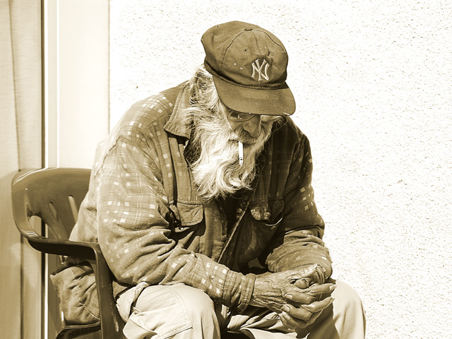
The man is definitely the whole of this image, he has quite a few details about him that just draws you in to look deeper. I'm not sure if the title does the image justice or not, but nevertheless it still fits the challenge.
The focus is pretty good, and the use of natural light is decent, though the whites are in danger of being blown out. There is a soft area just above the left shoulder that draws my eye away from the focus of the subject. I'm not sure if a shift in position would have helped combat that or not.
I don't know if I like the use of sepia for this image, I'd have to see the original color. The tones are very warm and for some reason I see this as a more melancholy image, suitable for black and white or a slightly blued tone, rather than sepia. Might be worth checking out.
The one thing that REALLY draws my eye are the man's hands. The back of his hands seems so wrinkled and old, but the tips of them look quite youthful, its a strange paradox and I think that little detail is what keeps my interest in this image.
Overall a VERY strong photo. A slight tone change and something to control the white in the photo could make it better. Very nicely done. I gave a 6.
The skin textures on the hand are very powerful. The duotoning was a good choice to emphasise the age of the subject. I also like the pose. What surprises me is that I like the negative space on the right. Its emptiness really supports the meaning here.
Its unfortunate that a great idea comes up more than once in a challenge. I must be honest, that detracts slightly from an image in my voting when I see the same idea more than once. This is a great image. I love how detail and sharpness in ghe photo, and the scence of intimacy. Very nicely done. It's not your fault, but like all the other dups, I must subtract 1 point from its overall grade. Good luck on a a great image. <8>







 Add photograph to your favorites
 Add photographer to your favorites


 Photographer found comment helpful.


