LOL
Controversial!
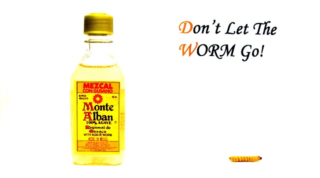
Ahh...the font... I tried to match the one on the bottle... hmmm didnt go down to well. Such a shame i learn how to dodge the day AFTER i submitted, i had to whack up the contrast to get rid of some nasty shadows, I had a go at dodging it this week and i think i would have done alot better!
Thanks for all the comments, i really enjoyed this challenge.
I understand why you felt you needed type - most billboards have some text. It should have been in the rules. That said, your font is ghastly! Your pic and message are good (a tad too overexposed though) - as is the composition, but I'll pretend your typography was a bit more finely honed!
: )
oouuu, i'm telling! you put TEXT on your entry. i'm deducting one point for each letter! your dimensions are 640x356, not the RECOMMENDED 640x320; i'm deducting a point for each pixel off. so, let's see, that's gives you a 10 - 57 = -47! (just to be fair, i had to count spaces and punctuation.)
--- ok, following is two more comments, a general one, then a specific one ------
ok, i am voting this challenge in 2 passes. in this pass, you will get a partial comment and a score. then i will come back to comment again. if you have any problem whatsoever with this comment, pm me and let me know. otherwise, take it with a grain of salt...i'm not trying to be a know-it-all, i'm just explaining where i'm coming from in voting this challenge. and, if this comment is NOT helpful (of if you think i'm full of $#!+), don't mark it helpful.
billboards are a science unto themselves. a lot of research has gone into determining just how much information a person can digest and retain in specific time spans. they use this information to develop formulas for determining the number of words and letters to use on billboards, as well as their sizes. they also determine the size and number of visual elements to include.
the graphics/photograph on a billboard are designed to get the point across in a moment. on the road, a driver will have less time with a billboard than a voter will give your image. this is a key element in the challenge: composing a shot that will get its point across quickly and succintly. along those lines, a strong composition will probably have few details and make strong use of negative space.
----------------------
great billboard! not to keen about your choice of fonts, but that's nit-picking. i also think you know you could have saved yourself a lot of anguish by leaving out the text...the image by itself works perfectly. hope you aren't getting beaten up too badly!
Not a bad idea that with a little reworking could really be effective. I would suggest that you get much tighter on the bottle to bring out the brand name more. Since your in so much tighter, the worm itself would also be bigger helping to make the message come accross more effectively. Your bottle kind of dissappears into the background. A slightly different color background would help that issue too. IMHO worth a reshoot and possible marketing to the company...
TC
I know the photo's been validated, so the text wasn't added in post-processing, however, i really love the photo and think it would have been a lot better without the text. The font (style,size and placement) doesn't work for me. I probably would have given this a 9 without it.
Wonderful idea and creativity. I like the idea alot. It really is too bright. I think darker and maybe a shadow to show depth would have helped this. Keep shooting creatively! 6
I have the feeling that the text leans to the right just a little bit. The edges of the bottle got lost in level & brightness adjustments. For a billboard, you would have to have those edges visible I think.





 Add photograph to your favorites
 Add photographer to your favorites


 Photographer found comment helpful.


