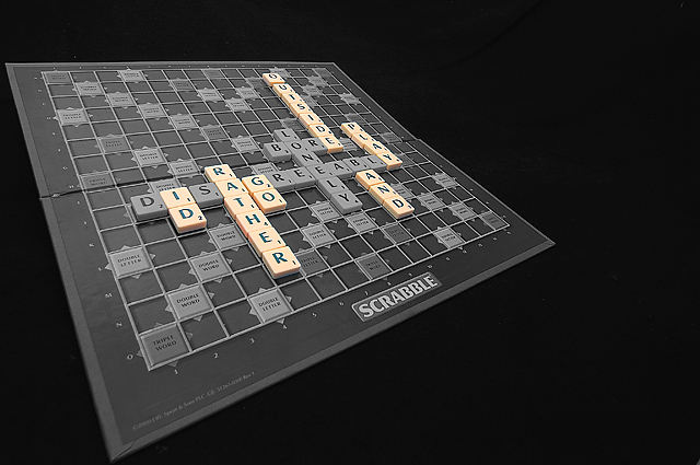
Yeah this should have placed higher. Great product shot and clever message. The angle bothers me a little but maybe that would be minimized if there was more space between the board's points and the frame.
This will probably be commented on a lot, but the alignment to the left with the unnessary black space to the right will bring scores down on this entry - I still gave it an eight for the "play on words" and other obvious skill involved.
I like scrabble dammit! Although I do usually agree with your sentiments. Great photo although it seems more like advertising design than normal photography to me. I expect it will do very well. 8






 Add photograph to your favorites
 Add photographer to your favorites

 Photographer found comment helpful.


