Challenge:Light On White (Basic Editing III) Camera:Sigma SD9 Location: Germany Date: Feb 27, 2005 Aperture: 9,5 ISO: 100 Shutter: 1/180 Date Uploaded: Feb 27, 2005
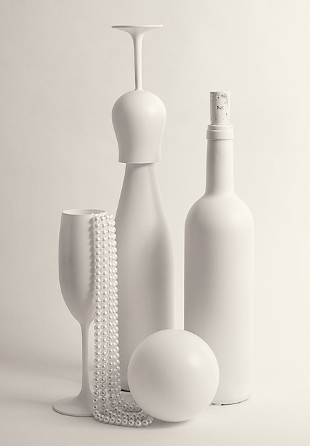
I wa smmoving all objects so many times and I have a few good shots. It was hard to choose one. This one has something which caught me, I can not explain why. Ok, let's see it will catch you too LOL.
Editing: proscessing in SPP (Sigma software) including brightness-contrast ajustment, BW toning, crop, USM.
Statistics
Place: 15 out of 431 Avg (all users): 6.4846 Avg (commenters): 8.4091 Avg (participants): 6.4205 Avg (non-participants): 6.5470 Views since voting: 1864 Views during voting: 518 Votes: 357 Comments: 27 Favorites: 2 (view)
Thank you all for your comments. I just wanted to clear that I had WHITE objects on a WHITE background. I added a bit of toning because I thought that white on white wold be not so accepted here but I was wrong. Actually I am again disappointed of some people unability to see wide. According to them the pure white square, an ooposite to Malewitch's "Black square", would be a perfect match - everything white and no BW. But it is my humble oppinion.
This is one of my absolute favorite compositions in the challenge, and so extremely well done. However, I am making myself really evalute what the challenge is, and I think it is ALL about using a light color on a background of white. I only see tones of B & W in this, so would feel it unjust to score it high. Sorry! EDIT: after so much variance in the interpretation of the challenge, I am coming back through and this time judging on photogrpahic quality only, and not if it meets the challenge within reason. Bumping up.
I have not been happy with so many white on white shots in this challenge. Somehow I think if it was intended to include white on white, the challenge would have read white on white. This is one of the few white on white shots I am impressed with though. Perhaps is the the shadows giving a grey look on your objects to distinguish them from the background creatively! Very Nice! One of my very few 10's on this challenge thus far.
Great set up. Great light. Sharp. Bautiful photo. The only thing is that somehow it is very static. Perhaps some off-center space or looser crop, but maybe that's just me. Anyway, still one of the best ones in this round. 10
Tecnicaslly and compositionally really outstanding. I have mixed feelings about the chroma of the white, it's so warm. Overall there's a bit of a sense of white-on-grey here, I am giving it a 9.
Sometimes you can spray paint an object and use it as part of a photo and people will not see the paint, only the effect it creates. But sometimes the paint is all that is seen and the image falls short of what it could be. The red wine bottle seems to look most natural with this treatment. I don' like the cork done this way. And that upside-down wine glass is right 'over the top.' Otherwise it is an interesting and fairly effective arrangement, well lit and exposed.
I like it, nice idea and original. The only thing I would've liked to see is the background whiter than what it is, and the right side is lighter than the left. Good Luck !





 Add photograph to your favorites
 Add photographer to your favorites


 Photographer found comment helpful.


