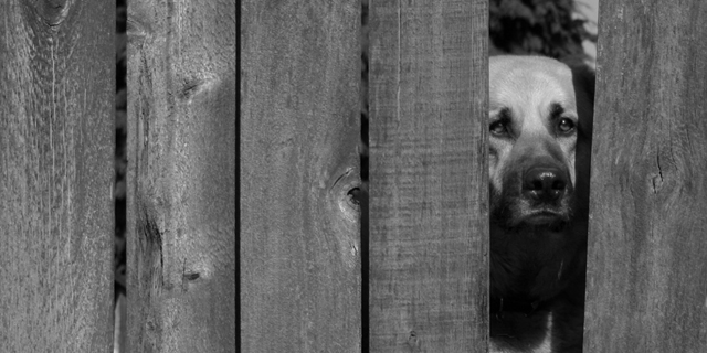
This dog, Sasha, lives across the alley from our house and is always peering through that missing space when we're outside. She's not abused or neglected to my knowledge, I just thought she had a sad look to her in this photo.
Statistics
Place: 28 out of 148 Avg (all users): 6.1121 Avg (commenters): 7.7273 Avg (participants): 6.0430 Avg (non-participants): 6.1653 Views since voting: 1609 Views during voting: 363 Votes: 214 Comments: 15 Favorites: 0
ok, i am voting this challenge in 2 passes. in this pass, you will get a partial comment and a score. then i will come back to comment again. if you have any problem whatsoever with this comment, pm me and let me know. otherwise, take it with a grain of salt...i'm not trying to be a know-it-all, i'm just explaining where i'm coming from in voting this challenge. and, if this comment is NOT helpful (of if you think i'm full of $#!+), don't mark it helpful.
billboards are a science unto themselves. a lot of research has gone into determining just how much information a person can digest and retain in specific time spans. they use this information to develop formulas for determining the number of words and letters to use on billboards, as well as their sizes. they also determine the size and number of visual elements to include.
the graphics/photograph on a billboard are designed to get the point across in a moment. on the road, a driver will have less time with a billboard than a voter will give your image. this is a key element in the challenge: composing a shot that will get its point across quickly and succintly. along those lines, a strong composition will probably have few details and make strong use of negative space.
---------------------
i love your idea, your composition, and your image. up close, the dog's face really helps to bring your point across. however, as a billboard, i'm not sure how well it works. even though the challenge only called for the image, it needs to be rendered in such a way as to allow for the message. here, i think it would take a bit more work. [as an aside, another one of the 'billboard design rules' is that they are typically laid out from left to right, with the graphical part on the left.] anyways, i hope this does well for you. good luck!
My evaluation method of this challenge is as follows:
1. Did you catch my eye while I was driving by? not sure.
2. If I didn't catch the text while I was driving, did you intrigue me enough to look for this billboard again? no words are needed.
3. Did you sell your stuff to me? Yes.
4. Extra thoughts: The photo needs a lot more contrast.
Sometimes I only get to see those billboards while driving at 30 or 40 MpH. I doubt I would see what's in this photo in such case.
had I seen it while standing at the traffic light, I would probably stare at it untill someone honks me to move on. It does disturbs me. Makes me wanna go to the next shelter and take all the dogs home with me. (7)
When I saw this photo, I'm afraid all I could think about was "Unsharp Mask." It is very effectively framed, and features an expressive model. I suppose there is even good argument for intentionally blurring the wood to help us focus on the dog's eyes; even knowing it's wrong, I wanted to see more texture in that 83% of the photo that was not the dog.






 Add photograph to your favorites
 Add photographer to your favorites


 Photographer found comment helpful.


