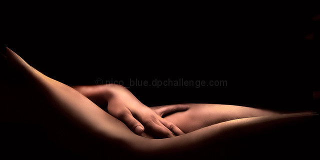
I find it really fascinating what can be implied with the human body...
Hopefully no one was too offended, tried to work with the concept that sex sells. Its really a tame image when you think about what is actually shown - a hand, and a body curve.
Statistics
Place: 8 out of 148 Avg (all users): 6.8443 Avg (commenters): 8.5217 Avg (participants): 6.6889 Avg (non-participants): 6.9590 Views since voting: 6977 Views during voting: 648 Votes: 212 Comments: 38 Favorites: 16 (view)
I like this. You can't really make out the subject well but that's what makes it more interesting. The lighting is great and the black background was a good choice. By looking at the skin tone I could tell this photo was filtered. Liked the idea of that also. This photo should of won a ribbon. Too bad it didn't.
maybe deserved a ribbon, but I think it didnt pull it off because of the viewers are unable to distinguish the subject in the photo. All I could see was the hand, not knowing what part of the body it is touching. Great composition, almost pulled it off, but a spectacular finish nevertheless.
I was surprised this didn't ribbon as well. It is an outstanding composition on it's own but even better in this challenge. The negative space you left would be perfect for the text to be displayed and makes, in your own words, a relatively tame body shot really jump up a few notches on the provacative scale. Great image. congrats!
I didn't give you any comments during voting, but gave this one a 10. I'm REALLY surprised this didn't get a ribbon. Also, I just looked at your profile page - and boy, I'm shocked that you only have one ribbon so far. I would make a bet with anyone that if you continue entering challenges in 2005, at least one of your resolutions will come true! Great job and keep going, please.
First of all, I love this photo - it's beautifully lit and nicely processed. Second, if I actually saw this on a billboard, I would probably have at least one accident. :-) Great job!
Well lit and the composition is beautiful. I hope the "ew, it's nudity" crowd doesn't vote you down. It certainly would be an eye-catching billboard! :o)
My evaluation method of this challenge is as follows:
1. Did you catch my eye while I was driving by? Oh yes.
2. If I didn't catch the text while I was driving, did you intrigue me enough to look for this billboard again? Most probably.
3. Did you sell your stuff to me? Yes.
4. Extra thoughts: Amazing lighting, very erotic but is very pleasing even to a conservative eye. there's a faint creole scent in the air...
Works great as a billboard but I would also love to see this one hung in my bedroom. Simply a 10.
If this were an actual billboard the Christian Coalition would be all over it, but the photo is fantastic. I love the negative space and the beautiful lighting. 9
ok, i am voting this challenge in 2 passes. in this pass, you will get a partial comment and a score. then i will come back to comment again. if you have any problem whatsoever with this comment, pm me and let me know. otherwise, take it with a grain of salt...i'm not trying to be a know-it-all, i'm just explaining where i'm coming from in voting this challenge. and, if this comment is NOT helpful (of if you think i'm full of $#!+), don't mark it helpful.
billboards are a science unto themselves. a lot of research has gone into determining just how much information a person can digest and retain in specific time spans. they use this information to develop formulas for determining the number of words and letters to use on billboards, as well as their sizes. they also determine the size and number of visual elements to include.
the graphics/photograph on a billboard are designed to get the point across in a moment. on the road, a driver will have less time with a billboard than a voter will give your image. this is a key element in the challenge: composing a shot that will get its point across quickly and succintly. along those lines, a strong composition will probably have few details and make strong use of negative space.
---------------------
i will be SHOCKED is this isn't on the front page. as an image, it's probably the cleanest of the challenge. as a billboard, it flat out rocks! this could cause cars to go off the road! excellent composition, impeccable control. good luck! one of my few 10s for the challenge.
Where can I find this City? This is where I wanna live!
This is the winner. The skinton, the composition, the light setup.. It's top-notch, and well worthy of 7.5 and a ribbon. Thisi s actually better then most billboards! So congratulation on the ribbon! I'm moving there! You nailed the SSS!! Simplicity Simplicity Simplicity ! Hooray! 10+++
The extended pinky finger is ridiculous. The creation of a title to force this "erotic" shot into the challenge mode is ridiculous. On a technical level, the NeatImage introduced gauzy blotchiness is offputting. The lighting is oce.







 Add photograph to your favorites
 Add photographer to your favorites

 Photographer found comment helpful.


