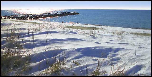
Returning for Comment: Superb shot and composition, but to me the burnout is a distraction. Perhaps if the sun was in the picture, for example, to offer a sunrise/sunset, it might just be emphasis, but being that it's just glare in the water, it doesn't work for me. In fact, the snow is lovely, but I could really see this being a winner if it were a winter beach sunrise! Or maybe putting someone out in the snow on a blanket, as that other picture did, might have been funny enough to make me ignore the burnout. Still better than avg shot = 6.
My evaluation method of this challenge is as follows:
1. Did you catch my eye while I was driving by? not sure I would recognize this.
2. If I didn't catch the text while I was driving, did you intrigue me enough to look for this billboard again? Hmmm...
3. Did you sell your stuff to me? That depends...
4. Extra thoughts: A very beautiful photo. But I'm afraid it does not serves it's purpose well here.
If I drove by it, I would need a lot more then a quick glance to understand what I see. Gave you a 6 just cause the photo itself really is beautiful.
ok, i am voting this challenge in 2 passes. in this pass, you will get a partial comment and a score. then i will come back to comment again. if you have any problem whatsoever with this comment, pm me and let me know. otherwise, take it with a grain of salt...i'm not trying to be a know-it-all, i'm just explaining where i'm coming from in voting this challenge. and, if this comment is NOT helpful (of if you think i'm full of $#!+), don't mark it helpful.
billboards are a science unto themselves. a lot of research has gone into determining just how much information a person can digest and retain in specific time spans. they use this information to develop formulas for determining the number of words and letters to use on billboards, as well as their sizes. they also determine the size and number of visual elements to include.
the graphics/photograph on a billboard are designed to get the point across in a moment. on the road, a driver will have less time with a billboard than a voter will give your image. this is a key element in the challenge: composing a shot that will get its point across quickly and succintly. along those lines, a strong composition will probably have few details and make strong use of negative space.
-----------------------
interesting idea for a billboard, would probably work from a higher perspective that would create more negative space. the blowout on the water is a bit too much. good luck!
I think the snow on the sand is incredibly beautiful, but the sun on the water is a little too strong for my taste - it detracts from that awesome, snow-covered sand. Otherwise, it's a really nice composition. I can imagine the text being placed on the water in the upper right area. Perfect slogan.









 Add photograph to your favorites
 Add photographer to your favorites


 Photographer found comment helpful.


