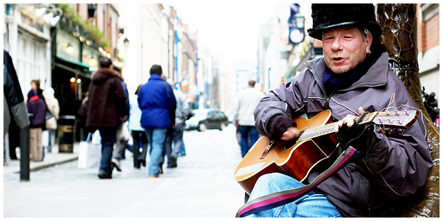
Street Musician with his Fender.
He's sitting in the bronze 'Palm Tree Seat' sculpture in Temple Bar. Difference in light is because he was in the shade.
When he saw me with the camera, his expressions suggested that he would love to have his picture taken. So, I gave him some money and took 2 shots.
Title comes from him, his music, surroundings and colours that pop out (hope you see the connection, but I am not too sure either!).
This image is 'supposed' to represent a Blues Radio Station.
Lens: Nikkor 50mm 1.8 @ f4.
Processing:
- Increased exposure
- Cropped to aspect
- Adjusted curves for contrast
- Applied Unsharp Mask
Statistics
Place: 42 out of 148 Avg (all users): 5.9479 Avg (commenters): 8.2000 Avg (participants): 5.7753 Avg (non-participants): 6.0738 Views since voting: 1643 Views during voting: 372 Votes: 211 Comments: 18 Favorites: 6 (view)
Hello from the critique club. It's been quite awhile since I pulled up a photo to critique. If I keep getting ones like this, I'll have to do it more often :)
I really like the composition and the way your subject seems to pop out from the rest of the photo. Catching him in the middle of a song, playing and singing, makes the subject stronger than if he was just sitting with the guitar. I almost feel like the viewer is his audience.
The background does seem a bit busy for the challenge, but not for the photo as it stands alone. The colors and activity in the background give a great feel of putting the subject in context. The background is bright, yes - but details are still visable, even at the end of the street. I think it adds some liveliness to the shot.
I have a great pair of gloves like that for playing cold-weather guitar also (great for winter photography as well!)
Overall, an excellent job of a candid, photojournalistic photo. I don't think I'd change a thing.
I just read the comments on this and just realized that in this one and in others, "busy" often makes a photo come alive and I wish it weren't always treated so poorly on DPC. This image is about life and that is not well represented always by singular simplicity.
Composition and overall this is a great shot. I do think it might have been better without the bright areas in the central--perhaps a gradient mask and levels adjustment could have subdued those some. Still, the subject is strong here and the bright areas do not detract from him like they would in a weaker shot.







 Add photograph to your favorites
 Add photographer to your favorites

 Photographer found comment helpful.


