My evaluation method of this challenge is as follows:
1. Did you catch my eye while I was driving by? Yes.
2. If I didn't catch the text while I was driving, did you intrigue me enough to look for this billboard again? I think so.
3. Did you sell your stuff to me? not sure... But you do make me think about it. You stayed with me even after driving away.
4. Extra thoughts: Interesting, funny, different. You did a pretty good job as the advertising creator. (8)
ok, i am voting this challenge in 2 passes. in this pass, you will get a partial comment and a score. then i will come back to comment again. if you have any problem whatsoever with this comment, pm me and let me know. otherwise, take it with a grain of salt...i'm not trying to be a know-it-all, i'm just explaining where i'm coming from in voting this challenge. and, if this comment is NOT helpful (of if you think i'm full of $#!+), don't mark it helpful.
billboards are a science unto themselves. a lot of research has gone into determining just how much information a person can digest and retain in specific time spans. they use this information to develop formulas for determining the number of words and letters to use on billboards, as well as their sizes. they also determine the size and number of visual elements to include.
the graphics/photograph on a billboard are designed to get the point across in a moment. on the road, a driver will have less time with a billboard than a voter will give your image. this is a key element in the challenge: composing a shot that will get its point across quickly and succintly. along those lines, a strong composition will probably have few details and make strong use of negative space.
--------------
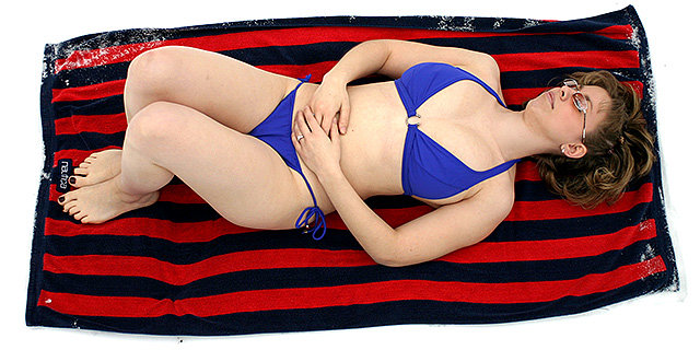
i think this idea would work just fine as a billboard. here, i can't tell if the white is supposed to be sand or snow, though. the idea of snow would be killer. [also, as an aside, from a composition standpoint, the billboard would need enough room to get the text on there.]
A wide shot would have made this MUCH better. Your whole point is talking about how "out of place" she is in the snow....but the SNOW is barely in your picture. It looks like you put a lot of effort into this, but the composition just doesnt give the full impact of your message. We want to "feel" the coldness by seeing more of what around her.







 Add photograph to your favorites
 Add photographer to your favorites

 Photographer found comment helpful.


