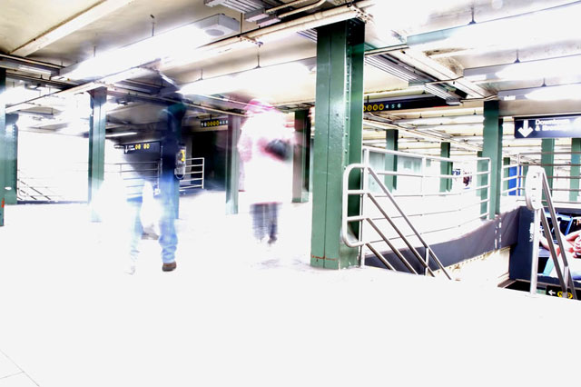
I really like this pic. It's like a memory... shadowy and bright at the same time. I like your lines and the sense of ascension and speed you've created.
this has some real interesting elements going for it. The title was distracting... framing could be better.. the movement is great, and works well with the white theme i think. Original - thanks!
this photo is really cool, but something about it just doesn't work right. perhaps a different angle on the shot - for example, the stairs are a little distracting, and i feel like there is too much detail in some other areas that draws the eye. but the style and idea is great.
I love the shot, you did exactly what they told you not to do, but this fits the challenge perfectly. in my top ten for the challenge, possibly a favorite
I don't know if a lot of people are going to like this, but I think it is cool. I think it meets the chanllenge with the light green poles, the jeans, and the ladies coat. 8
Well, this picture kind of says f-you to the instructions, huh? :) I like the picture, but I would have tried to leave the figures in the picture for a slightly larger percentage of the exposure in order to make them a bit more visible.
In this case "Be sure you do over expose your highlights." It's an interesting shot. I like how unconventional use of light can transform a solid and boring industrial space into an ethereal one. But in the end, the space still wins, and it is an ugly space.






 Add photograph to your favorites
 Add photographer to your favorites


