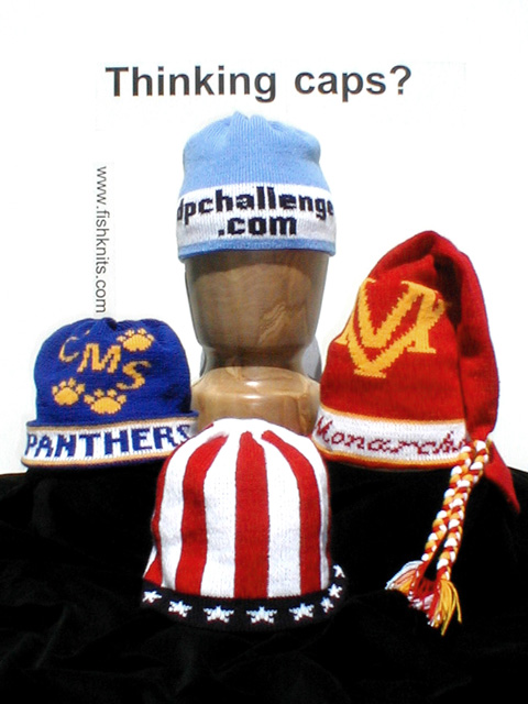
Picture was cropped and adjusted for brightness and contrast in Photoshop. Lettering was included during setup for the shot, by printing on transparencies and using spray adhesive to affix to the backboard of the setting. Hats were knit by my daughter!
Statistics
Place: 36 out of 79 Avg (all users): 5.5412 Avg (commenters): 7.5357 Avg (participants): 5.4085 Avg (non-participants): 5.6179 Views since voting: 1718 Votes: 194 Comments: 32 Favorites: 1 (view)
Thank you to all who took the time to look at, and vote for, my photo. This was my first entry, and it was done for two reasons: (1) to surprise my photographer daughter, "Digiteyes", who LOVES this site! You need to check out her pics! And, (2) to create an "ad" that showcased my other talented daughter's creations, custon knit caps! The picture worked on both counts. It's been an adventure! I was disqualified and the picture removed almost immediately, because the lettering looked photoshopped. For all those who asked: Yes, the cap is real. Yes, the lettering on it is knitted into the cap. This cap was given to my daughter who lives and breathes dpchallange! Yes, more can be knit. No, Drew hasn't yet given permission to use the dpchallenge logo, although he, too, has asked for a cap. Yes, the URL is real! No, if I remove the URL, how can the ad work? Yes, I know the URL is vertical; it got your attention didn't it? Yes, Moondoggie, that is a Monte Vista Monarchs cap. My daughter knit dozens for their school to sell for a fundraiser. And, for all the others who didn't notice the URL and asked about the caps, go to www.fishknits.com
Nice job. I think switchin the patriotic hat, and the panthers hat might have made it feel a little better balanced for me, and then there wouldn't be the blending of the background and blue field of the hat
Very good. You must make these caps. I think it would have been neat if you would have made the 'Thinking caps?' to look like it was knitted as well. And maybe not such a black surface. It's really good thogh.
Very nice composition and a good way to show the variations of hats that can be knitted. I especially like the contrast between the black and white background.
i dont like the placement of your domain name. also, putting a dpchallenge.com hat in the photo seems like of lame. it's sort of asking for brownie points.
Great idea and set up. Do you really sell them? Only picky comment is that the focus is a little off and the edges of the hats get kind of lost in the black cloth.
Well, I assume that this test was not added into the photo with an editor but I think this is borderline. The layout here is nice but I think the test could have been left out to make a better photo. The THINKING CAPS text needs to be centered between the top of hat and the top edge of the paper. The URL is dangerously close to the blue hat. I would have considered leaving this out of the photo...






 Add photograph to your favorites
 Add photographer to your favorites


 Photographer found comment helpful.


